
Field monitoring mobile app design concept
A field monitoring mobile app concept for maps, sensor data, alerts, and environmental status.

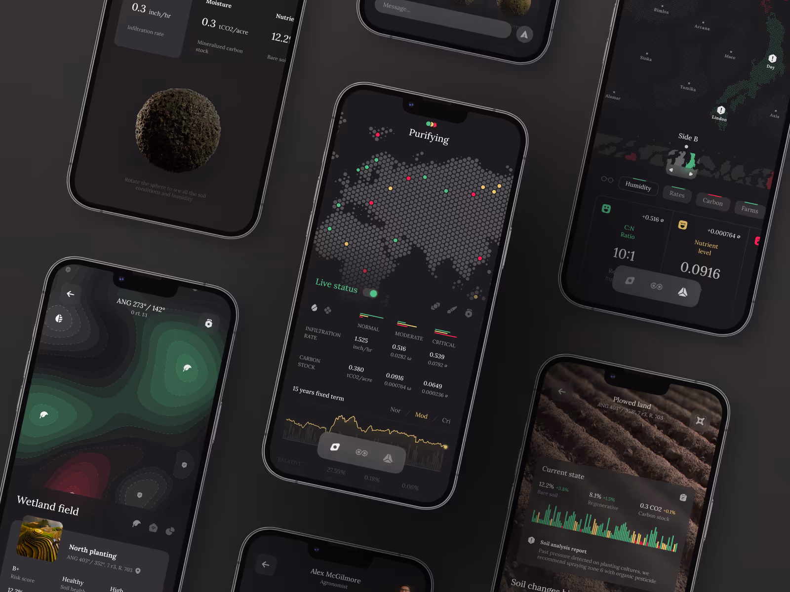
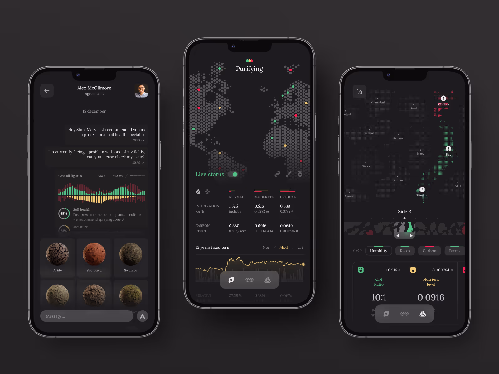
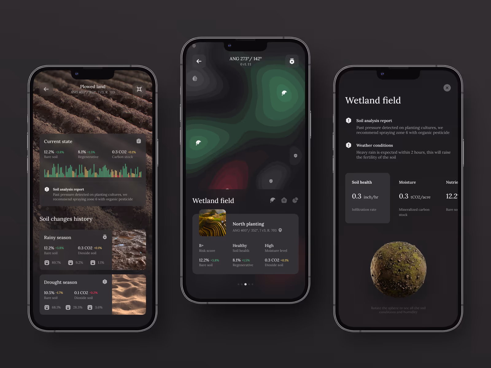
Environmental monitoring depends on quick reading of changing conditions. This direction brings location data, sensor signals, and field status into a mobile interface that can be checked without slowing down the work.
The challenge
Field teams often deal with information that changes by location, time, and condition. Maps, sensor readings, alerts, and historical data all matter, but they can become difficult to read when everything competes for attention on a small screen.
The challenge was to make the app feel useful in the field: fast to scan, clear about what needs attention, and detailed enough to support follow-up decisions.
Concept direction
We shaped the experience around a map-first view supported by clear status layers. The interface gives users a way to move from a broad field overview into specific readings, alerts, and condition details without losing context.
The visual system uses dark surfaces, focused data cards, and strong status contrast to keep critical information readable. Charts and environmental metrics are treated as working signals, not decorative dashboard elements.
Scope of work
- Mobile UX direction for field monitoring
- Map-based status and location views
- Sensor data and environmental metrics
- Alert and condition hierarchy
- Dark mobile interface system
- Development-ready app screens
Key decisions behind the concept
- Map becomes the main operating context. The map keeps location and condition data connected, so users can understand where a signal belongs before opening details.
- Critical readings stay visually distinct. Alerts and abnormal values are separated from routine information to support faster response.
- Dense data is broken into scannable cards. Sensor readings, charts, and status details are grouped into smaller blocks that work better on mobile.
- Dark UI supports focus in data-heavy screens. The visual direction gives the product a technical feel while keeping important values legible.
Concept outcome
The concept gives a field monitoring product a stronger first product direction. It shows how environmental data can move from scattered readings into a mobile experience that supports fast checking, comparison, and response.
For a team planning an MVP, it creates a shared reference for map behavior, status hierarchy, data visualization, and the core screens worth building first.
Need a sharper product direction?
Start with a focused concept that turns the core experience into screens your team can evaluate, discuss, and build from.


