
Intelligent contact manager product dashboard design concept
A smart contact manager interface for people, filters, tags, and daily relationship workflows.


Busy professionals do not need another static address book. They need a working space that helps them understand who matters now, what changed, and which relationships need follow-up.
The challenge
Contact management becomes hard when people, notes, tags, reminders, and communication context live in separate places. A useful product has to make relationships easier to understand without asking the user to manually organize everything.
The challenge was to make the interface feel intelligent, but still controlled. Smart features had to support the workflow instead of taking over the product.
Concept direction
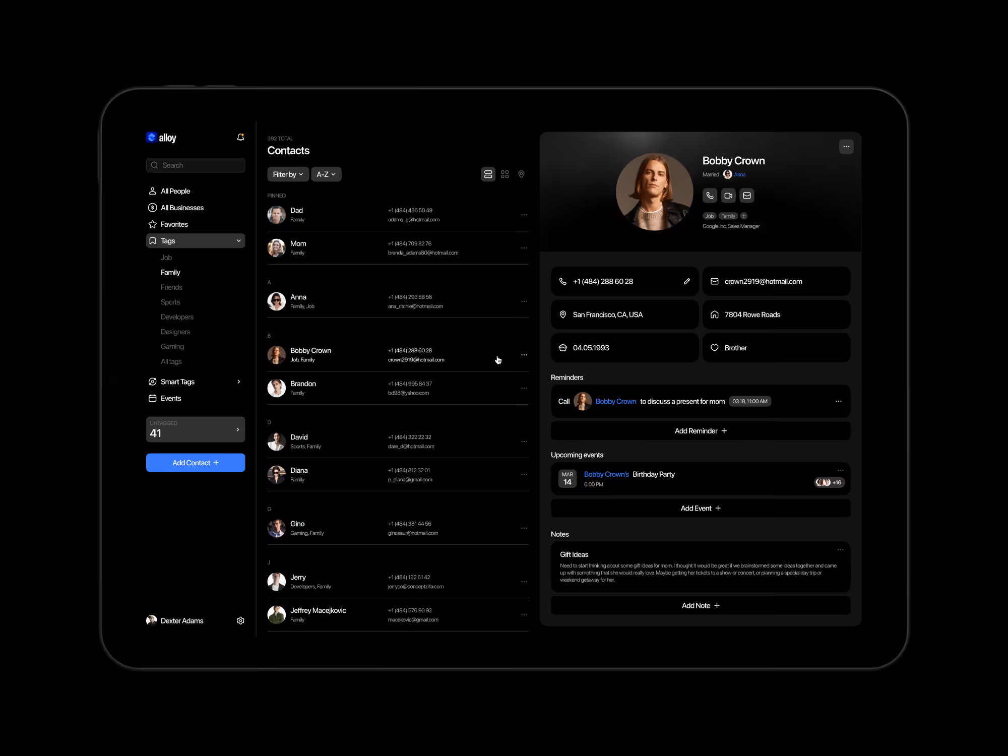
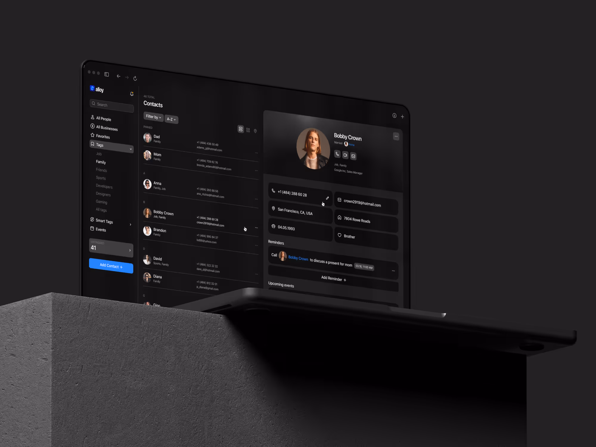
We shaped the dashboard around contact context first. Profiles, lists, filters, tags, and follow-up cues work together so the user can move from a broad contact view into a specific relationship without losing the thread.
The interface uses a clean dashboard structure because productivity tools need speed. Smart tags and filters are treated as product behavior, not decorative labels.
Scope of work
- Contact management product UX direction
- Smart tags and filter logic
- Contact profile and list views
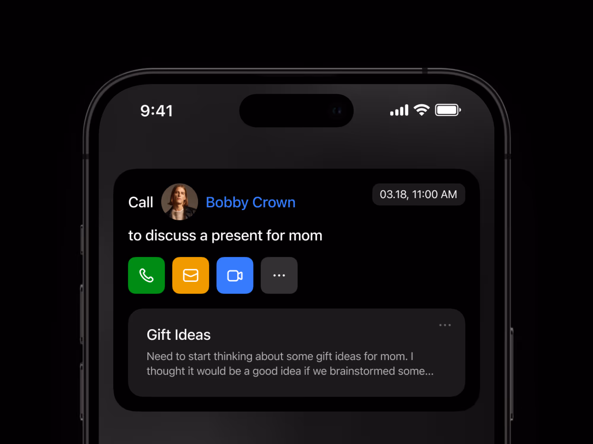
- Workflow support for follow-ups
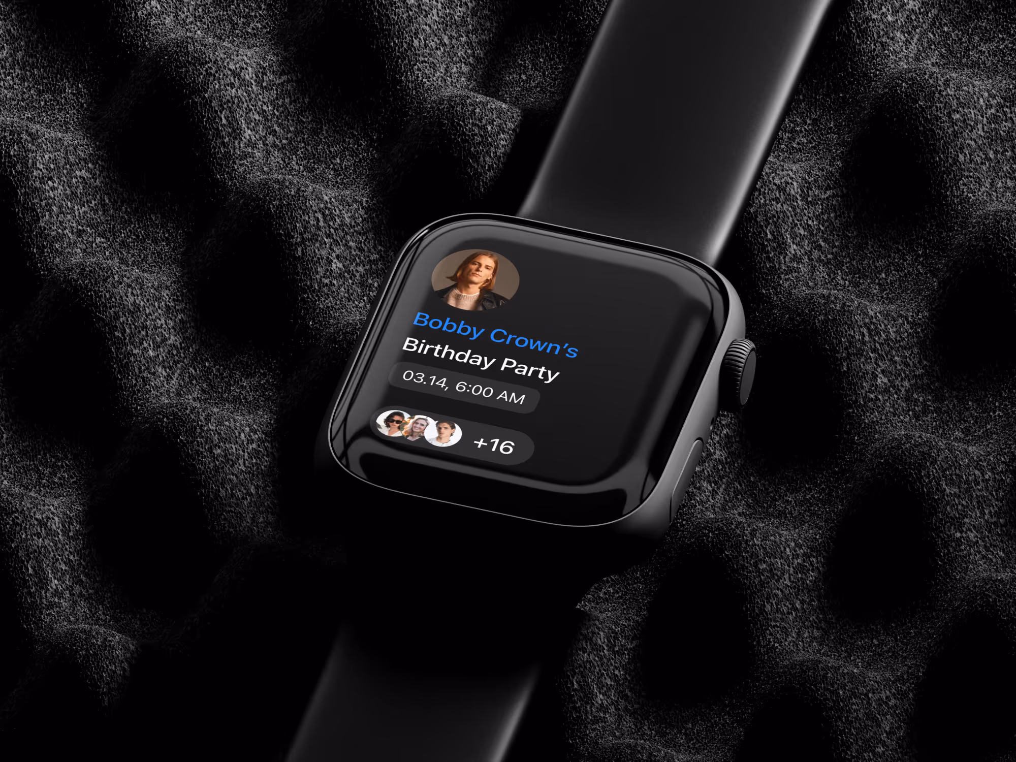
- Cross-device product experience
- Responsive microinteractions for clearer feedback
- Development-ready dashboard assets
Key decisions behind the concept
The main design decisions focused on making contact data feel active, useful, and easy to organize.
- Contact context before raw lists. The product direction puts relationship context close to the contact list, so users can understand why a person matters before opening deeper details.
- Filters behave like workflow tools. Smart tags and filters help users shape their day. They are not just labels; they help turn a large contact base into smaller, actionable groups.
- Productivity stays lightweight. The interface supports faster organization without making the product feel like a heavy CRM. The goal is clarity, not enterprise complexity.
- Microinteractions support confidence. Responsive feedback helps users understand when filters, tags, or profile states change. The motion layer should improve clarity, not become the main feature.
Concept outcome
The concept turns contact management from a static directory into a clearer product direction. It shows how smart tags, filters, contact profiles, and follow-up workflows can work together inside one productivity dashboard.
For a founder or product team, that gives the idea a stronger foundation before development. The team can evaluate the core workflow, decide which smart features matter first, and shape the MVP around real daily use.
Need a clearer product direction?
If your team needs to turn a productivity idea into a product concept people can evaluate, start with a focused design direction.


