
ERP SaaS dashboard design concept
ERP SaaS dashboard concept for logistics finance, invoices, payroll, and operational data.


Logistics finance work depends on many moving parts: revenue, expenses, invoices, payroll, and forecasts. The goal was to make that information easier to compare without turning the product into a dense accounting tool.
The challenge
ERP dashboards can become hard to use when every module competes for attention. Finance teams need to see the current state of the business quickly, but the information often lives across invoices, payroll records, revenue reports, expenses, and operational analytics.
The concept focuses on the moment when a team needs to understand what changed, where the numbers are moving, and which part of the operation needs attention.
Concept direction
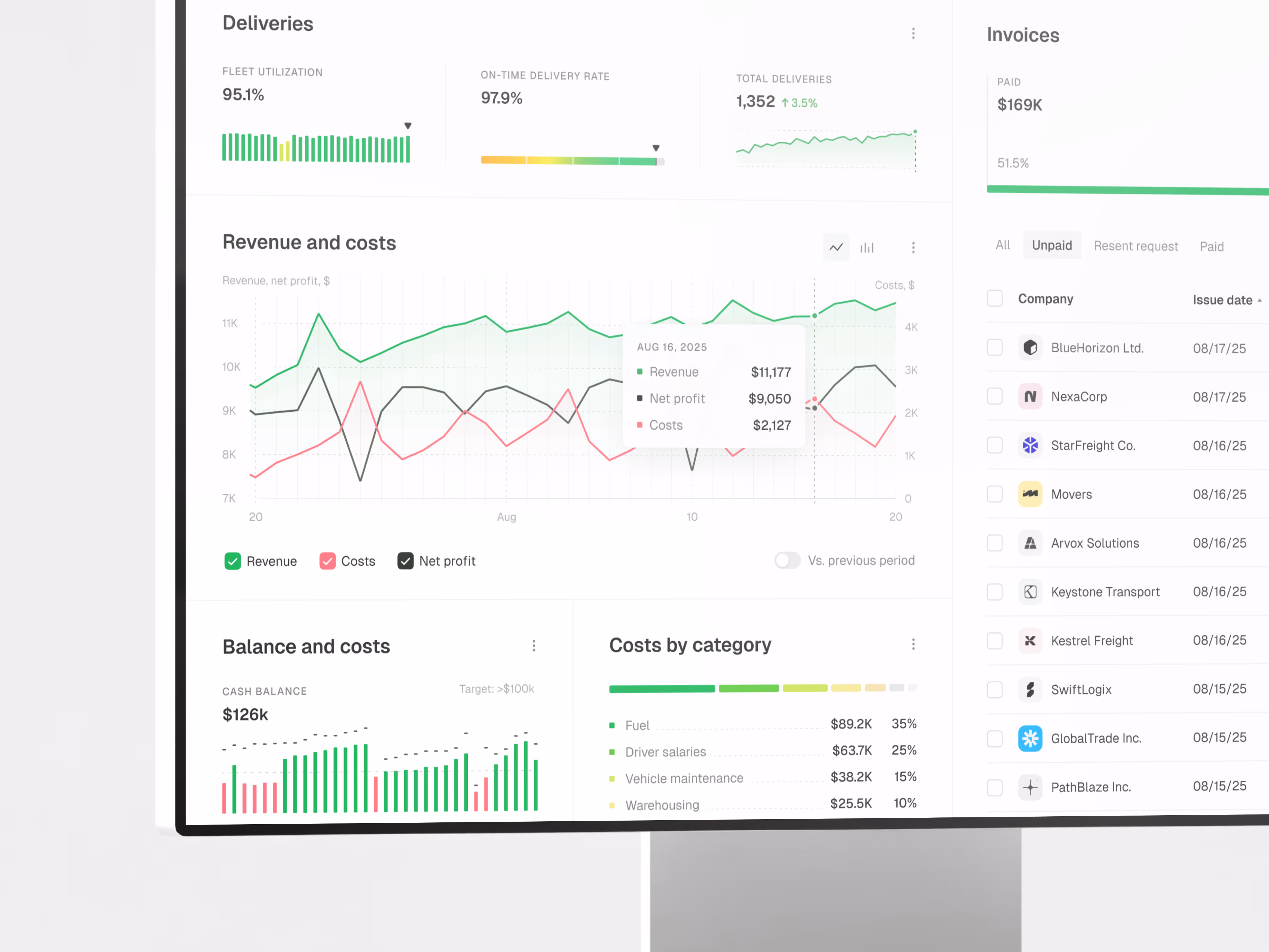
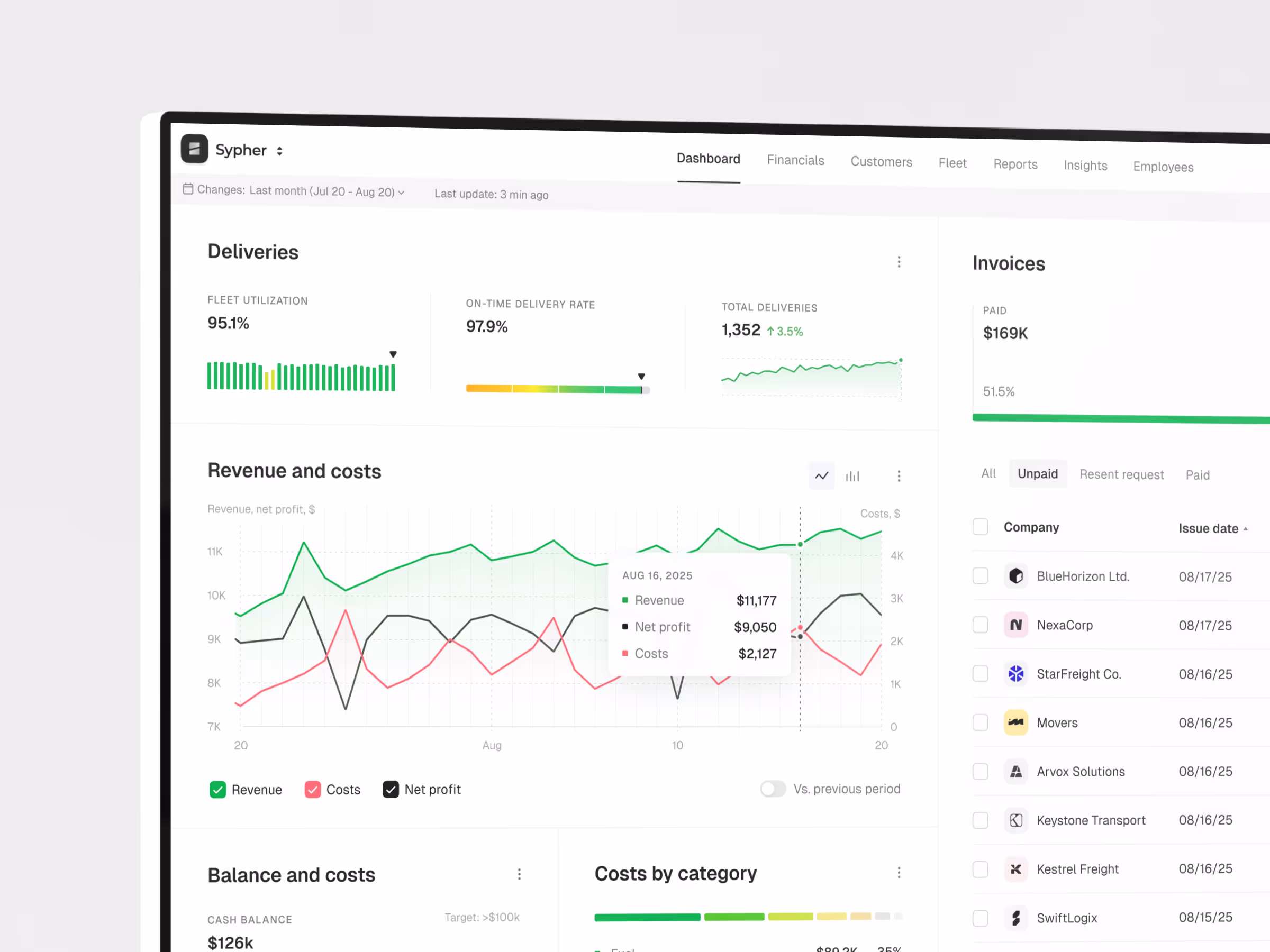
We shaped the dashboard around a central finance overview first. Revenue, costs, payroll, invoices, and analytics sit in one working structure so the user can compare signals without jumping between separate tools.
The interface keeps the visual system restrained because ERP products need density. Cards, charts, tables, and forecasting areas are designed to carry complex information while staying clear enough for daily use.
Scope of work
- Financial dashboard UX direction
- Revenue, cost, payroll, and invoice modules
- KPI and forecasting views
- Interactive chart and analytics hierarchy
- ERP navigation and data organization
- Development-ready dashboard assets
Key decisions behind the concept
The main design decisions focused on making financial context easier to scan, compare, and act on.
- Finance overview before deep modules. The dashboard starts with the state of the business, then lets users move into specific finance areas. That keeps the main screen useful for daily review.
- Revenue and expenses stay close together. Income and cost signals are treated as one decision layer. This makes it easier to understand margin, cash flow pressure, and operational movement.
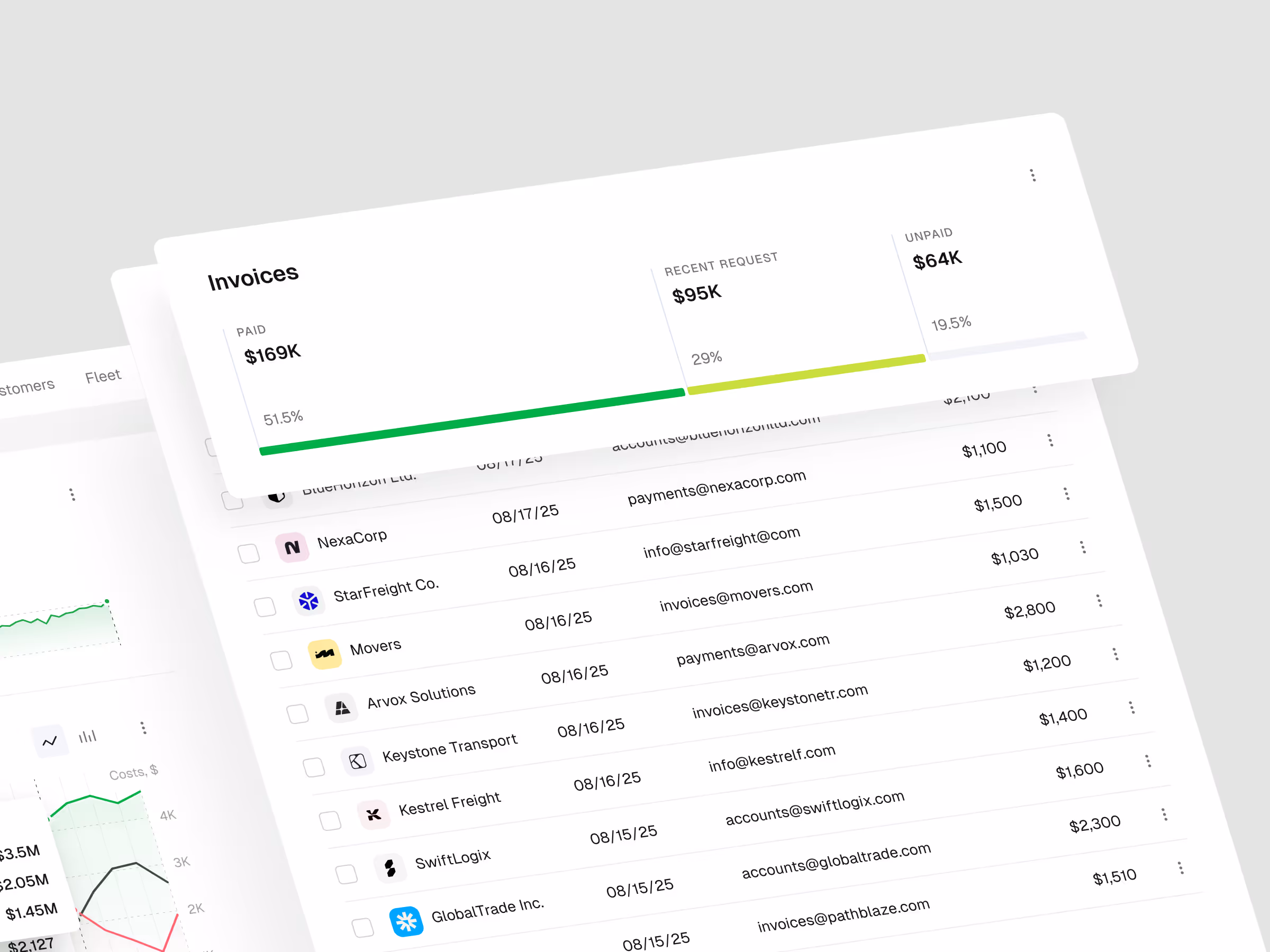
- Invoices and payroll remain visible. The concept avoids hiding practical finance work behind abstract analytics. Invoices, payroll, and costs stay close to the dashboard because they shape real decisions.
- Charts support comparison, not decoration. The analytics layer is built to help users compare periods, spot movement, and understand where the business is changing.
Concept outcome
The concept gives a logistics team a clearer foundation for an ERP finance product. It shows how revenue, payroll, invoices, expenses, and forecasting can work together inside one dashboard instead of feeling like separate back-office tools.
For a founder, product owner, or internal team, that clarity matters before committing to a larger build. It creates a shared reference for product scope, finance workflows, and the first development priorities.
Need a clearer product direction?
If your team needs to turn complex operations into a product concept people can evaluate, start with a focused design direction.


