Website design for private golf club
A website design concept for a private golf club, built around a calm premium mood, membership storytelling, and a clear visual direction.

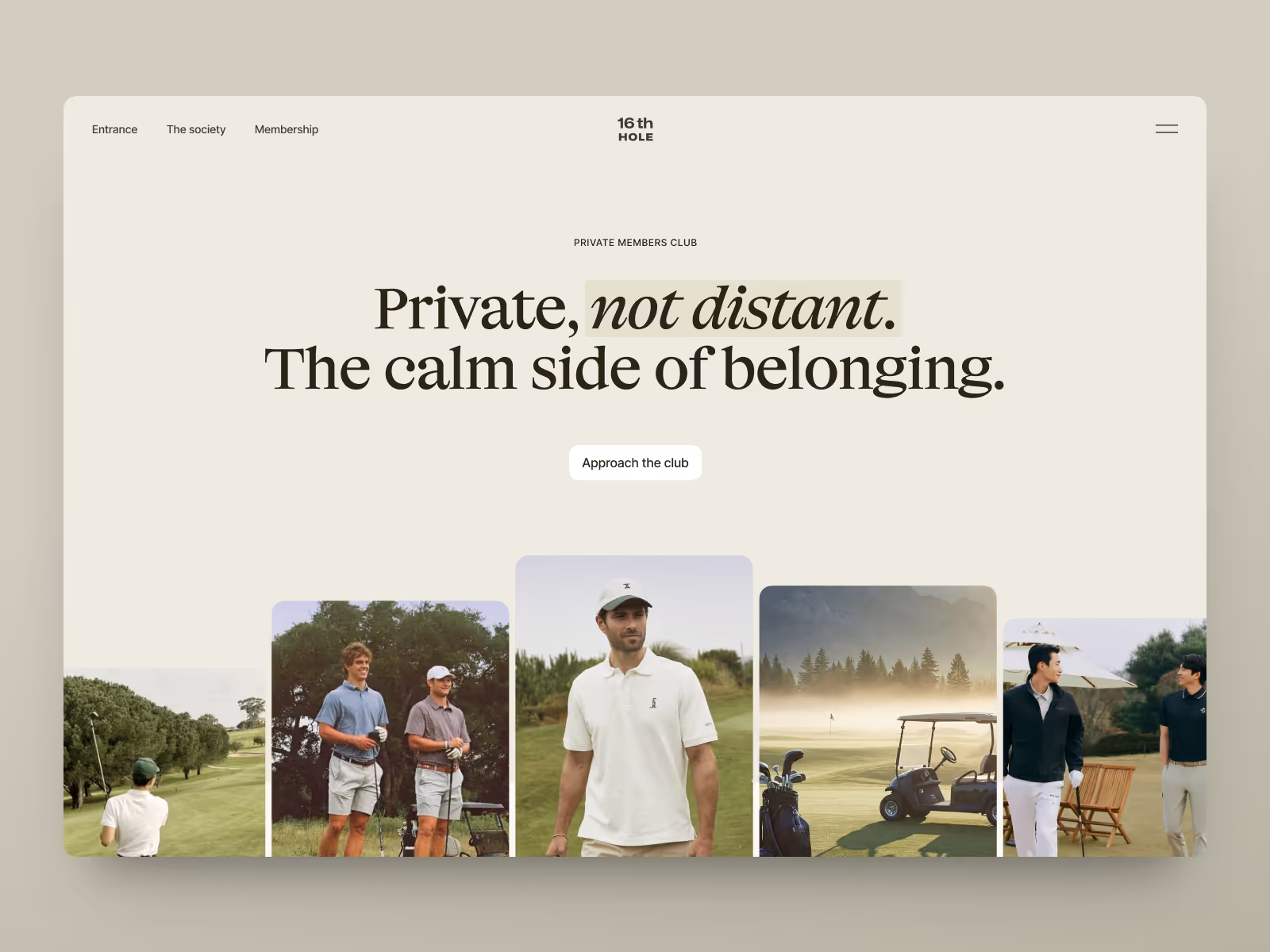


A private golf club website has to create a feeling before it explains the offer. For this concept, the goal was to shape a digital presence that felt calm, premium, and selective from the first screen.
The challenge
The club needed a visual direction that could support early conversations around positioning, membership, and future website structure. The concept had to make the experience feel desirable before the full site was planned or built.
It also needed to avoid the usual hospitality pattern: too much copy, too many offers, and a design that feels more like a booking page than a private club.
Concept direction
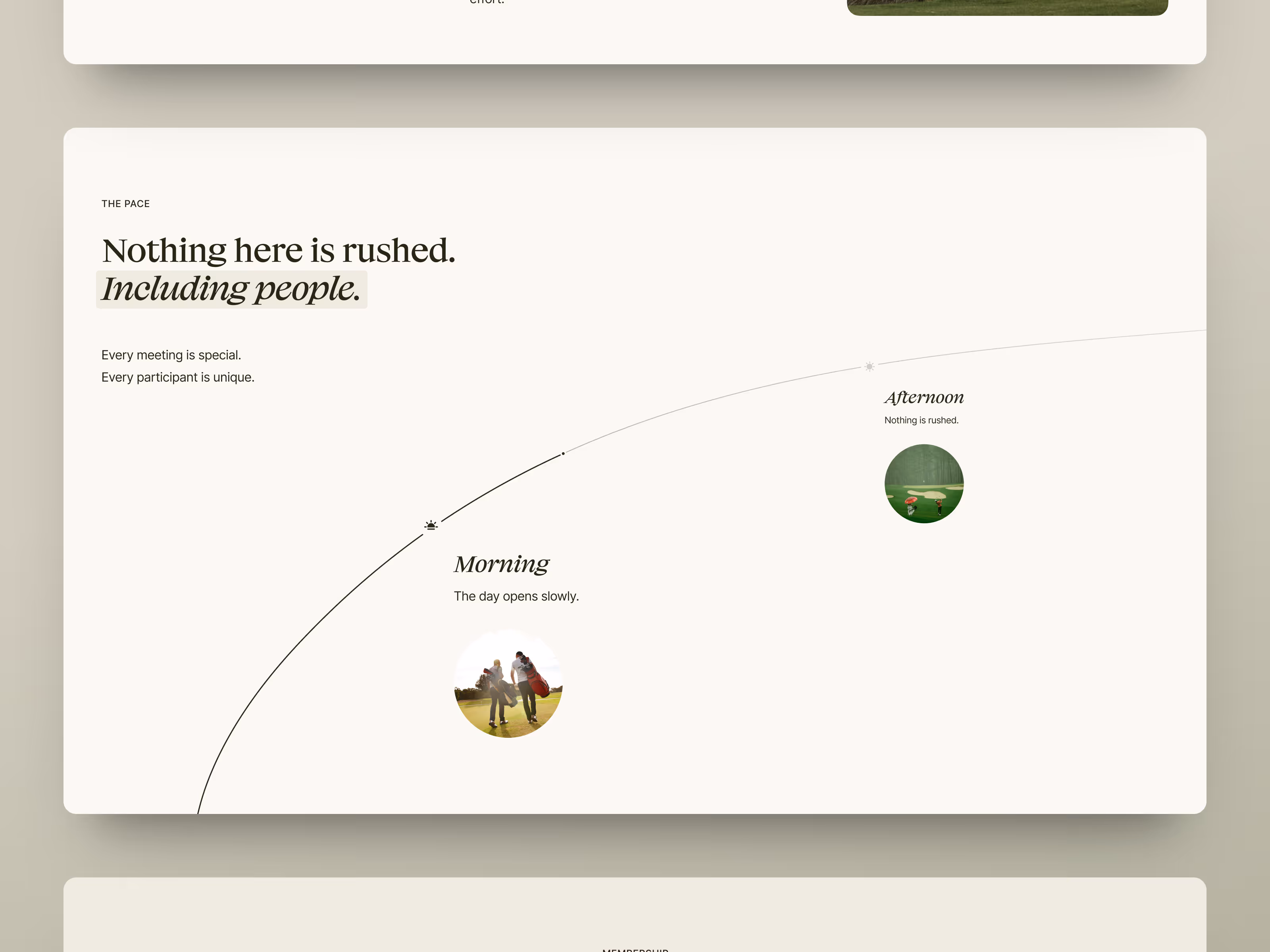
We shaped the concept around a few core screens: the homepage, a society section, a membership page, and supporting content blocks. The structure stayed simple on purpose. The main work was in defining the mood, hierarchy, and visual rhythm of a private club experience.
The visual language uses a restrained palette, large photography, editorial spacing, and soft interface details. Instead of pushing every offer forward at once, the design creates a slower first impression.
Scope of work
- Strategic visual direction for a premium club website
- Homepage and membership page experience
- Modular UI kit within the concept scope
- Photography-led storytelling system
- Editorial content hierarchy
- Development-ready concept assets
Key decisions behind the concept
A few decisions made the concept useful as a business direction, not just a visual exercise.
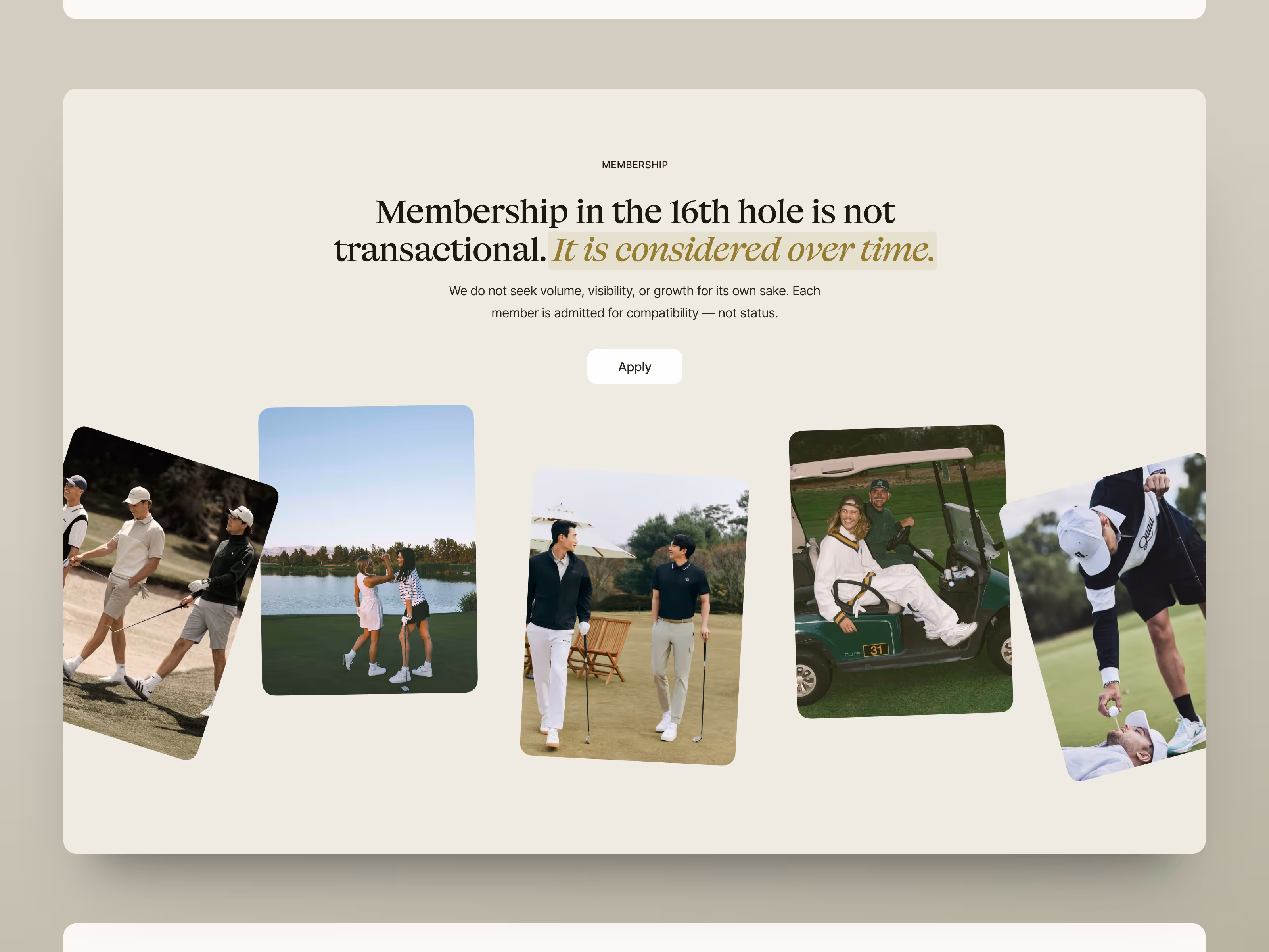
- The site needed to feel selective before it explained membership. The first screen creates atmosphere before asking the visitor to act. That helps the club feel considered and desirable rather than transactional.
- The membership story needed a visual language. Membership is treated as part of the club’s positioning, not just an information section. The concept gives the offer a clearer emotional frame: access, belonging, and a quieter sense of status.
- The system had to support future expansion. The concept defines a visual rhythm, UI language, and content hierarchy that can extend beyond the first screens. That makes the direction easier to discuss, scope, and turn into a full website later.
Concept outcome
The concept turns an early digital direction into something stakeholders can evaluate before production. It shows how the club can feel premium without becoming cold, and how membership can feel closer to belonging than a transaction.
It also gives the website a clearer foundation for the next step: visual language, content hierarchy, and the first development scope.
For a founder, owner, or team, that clarity creates a shared reference for pitch conversations, brand direction, and content planning.
Have a project idea to shape?
Tell us what you need to test, present, or clarify. We’ll help turn the idea into a focused design concept with a clear direction.