Private golf club brand identity design
A private golf club brand identity concept shaped around calm luxury and membership prestige.


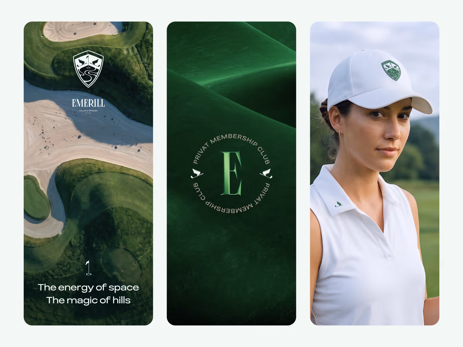
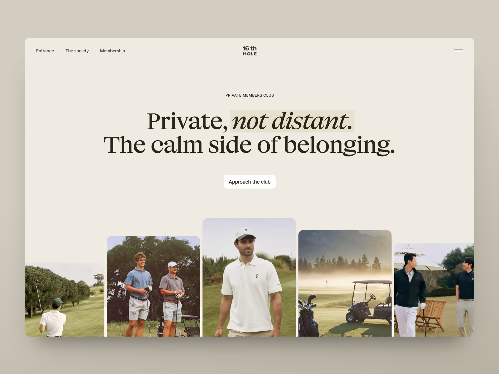
A private club identity has to signal access before it explains anything. The direction here focuses on restraint, typography, and visual rhythm so the brand can feel premium without becoming distant.
The challenge
Golf club branding can easily become too traditional, too exclusive, or too generic. The identity needed to feel selective and established, but still warm enough to support a modern membership experience.
The challenge was to define a visual direction that could carry the club’s atmosphere across digital and physical touchpoints without relying on loud luxury cues.
Concept direction
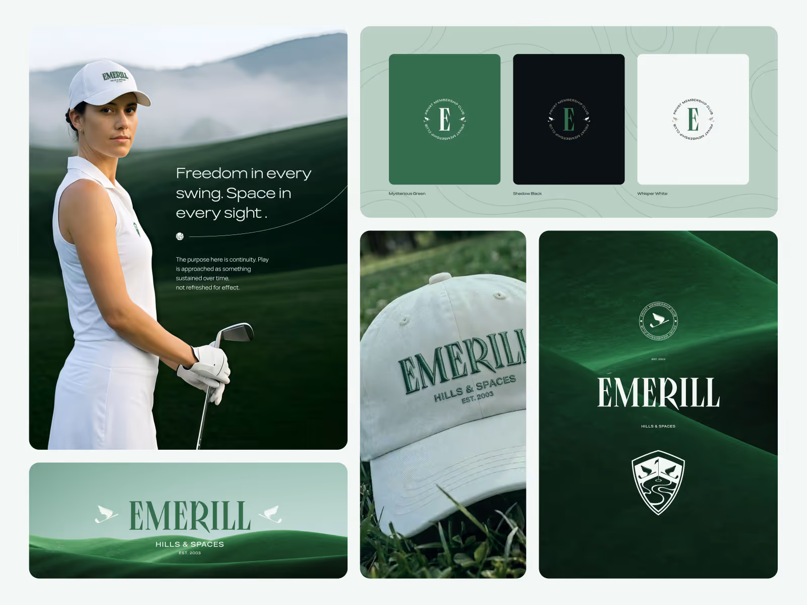
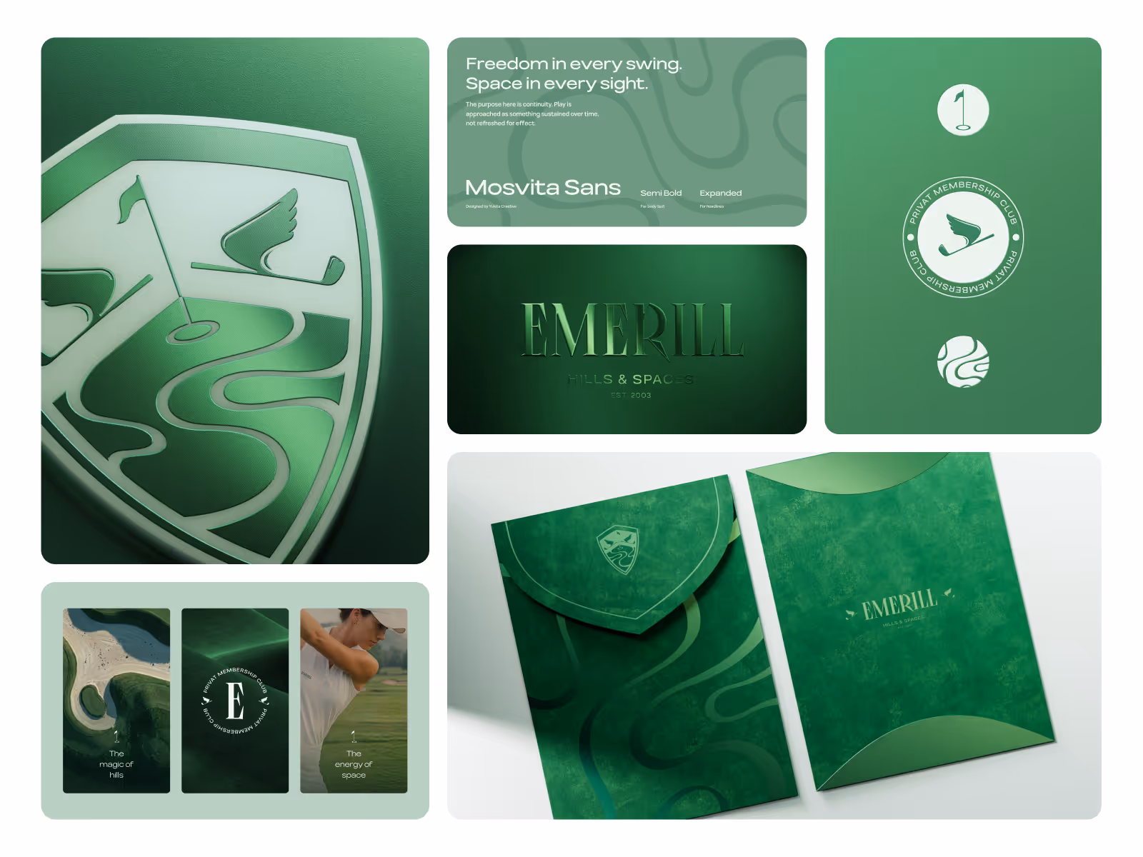
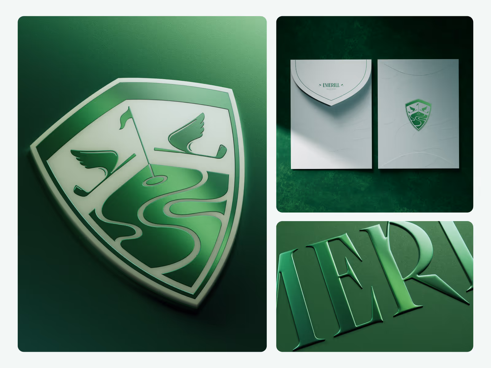
We shaped the brand around quiet confidence: restrained typography, muted color, spacious composition, and membership-focused details. The identity is designed to feel calm, private, and clear rather than decorative.
The system gives the club enough visual structure for future website screens, member materials, presentations, and branded communication while keeping the overall mood consistent.
Scope of work
- Brand identity direction for a private golf club
- Logo and visual identity exploration
- Typography and color system
- Membership-focused brand language
- Presentation-ready brand assets
- Digital-ready identity foundations
Key decisions behind the concept
- Restraint carries the premium signal. The identity avoids visual noise and lets spacing, typography, and tone create the sense of quality.
- Typography sets the mood early. Type choices help the brand feel established before the user reaches detailed content.
- Membership cues stay subtle. The identity suggests belonging and access without turning the brand into a closed or overly formal experience.
- The system can extend into digital work. The brand direction gives future website and product screens a clearer visual foundation.
Concept outcome
The concept gives the club a clearer brand direction that can guide both digital and physical touchpoints. It shows how the identity can feel selective, calm, and established without relying on loud luxury cues.
For a founder, owner, or team, that direction becomes a shared reference for website design, membership materials, pitch conversations, and the next visual assets.
Need a sharper brand direction?
Start with a focused concept that turns the core identity into assets your team can evaluate, discuss, and build from.