Architecture and construction company website design concept
Construction expertise is easier to trust when services, proof, and project scale are clear.

The project direction turns a service-led website into a clearer credibility tool. Services, project context, and company expertise stay close enough for visitors to understand what the firm does, why the work feels reliable, and when it makes sense to start a conversation.
The challenge
Architecture and construction websites often have to earn trust before they explain the offer. A visitor needs to see that the company understands complex projects, not just that it can present nice images.
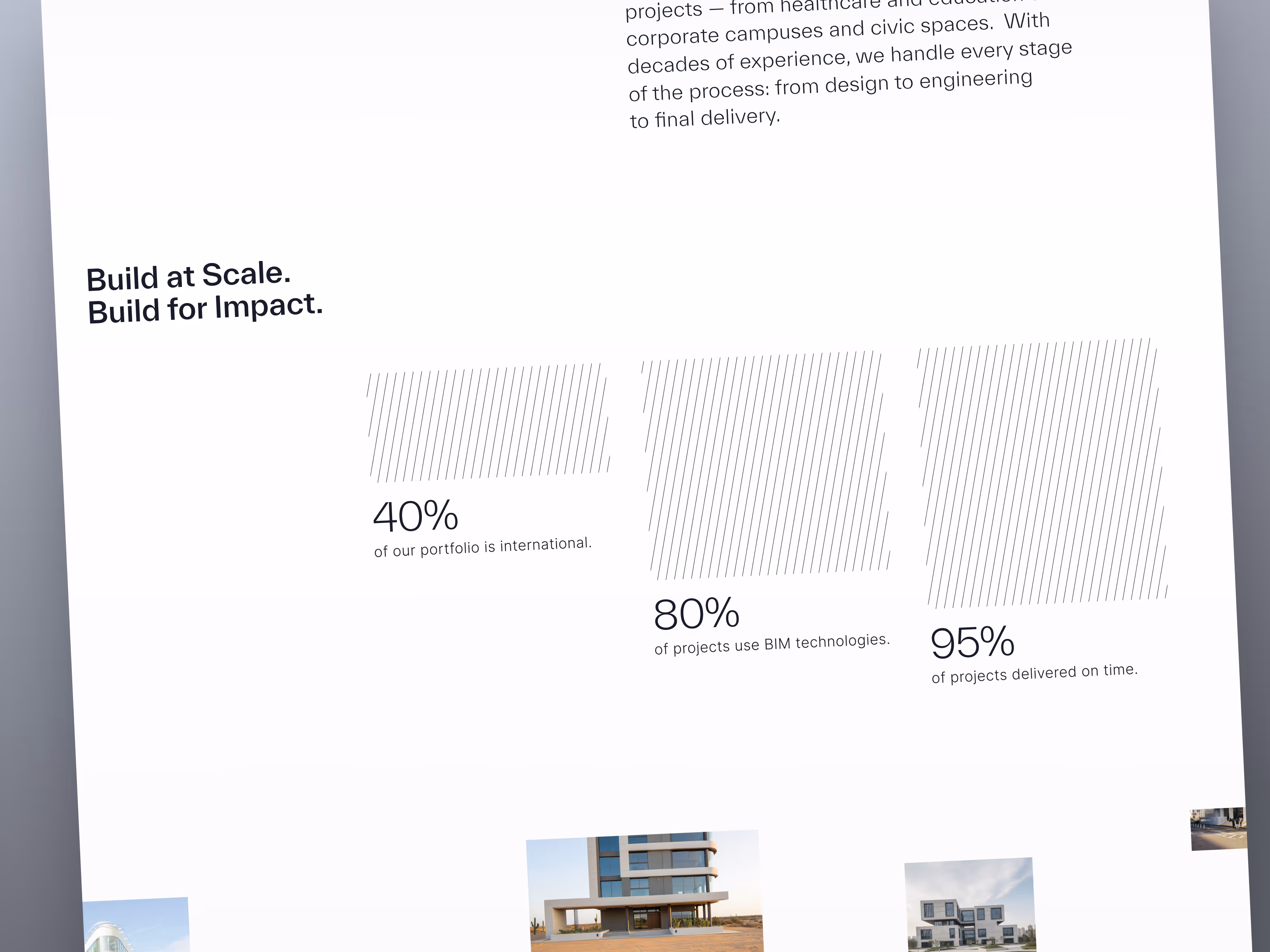
The page needed to communicate stability, scale, and professional judgment without becoming heavy or corporate. It also needed a simple structure that could guide different visitors: potential clients, partners, and stakeholders comparing the company’s capabilities.
Concept direction
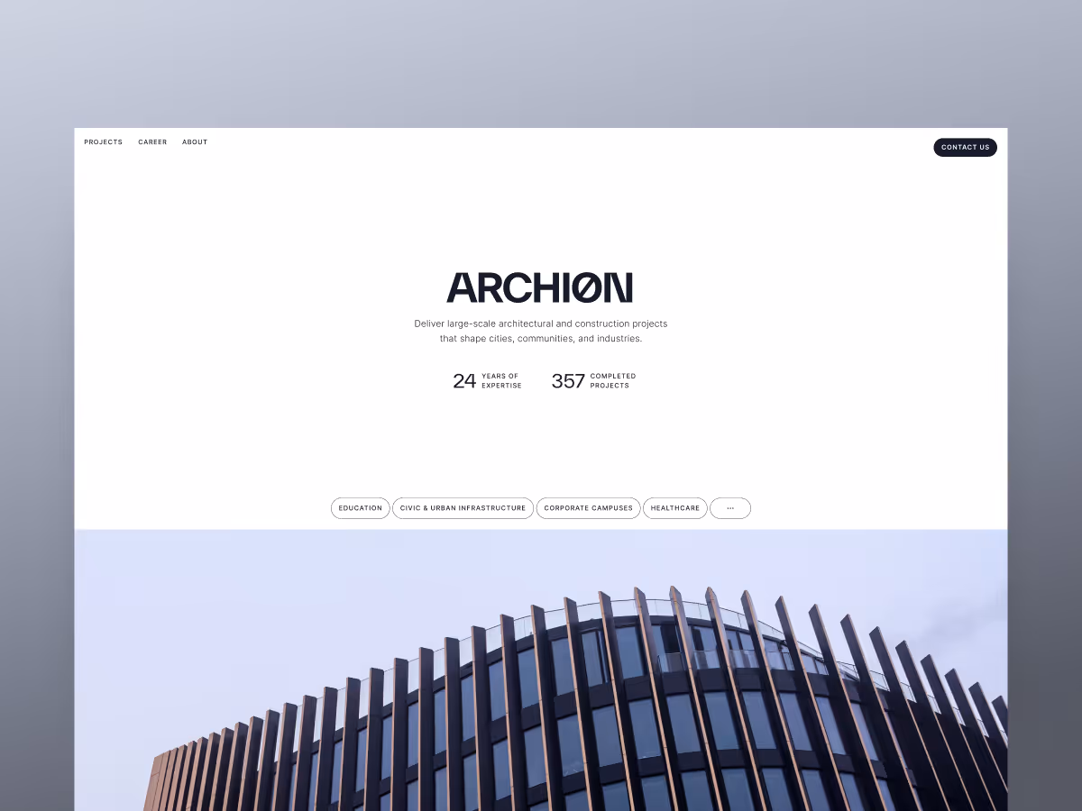
We shaped the website around credibility first. The layout gives the company room to present its work with clarity, while keeping services and project context easy to scan.
The visual system stays restrained: strong typography, clean spacing, and a structured rhythm. That helps the site feel professional and architectural without making the experience cold or overloaded.
Scope of work
- Website design direction for an architecture and construction company
- Service and expertise presentation
- Project storytelling structure
- Trust and credibility signals
- Content hierarchy for lead qualification
- Development-ready website concept assets
Key decisions behind the concept
The main design decisions focused on making the company feel capable, reliable, and easy to understand from the first screen.
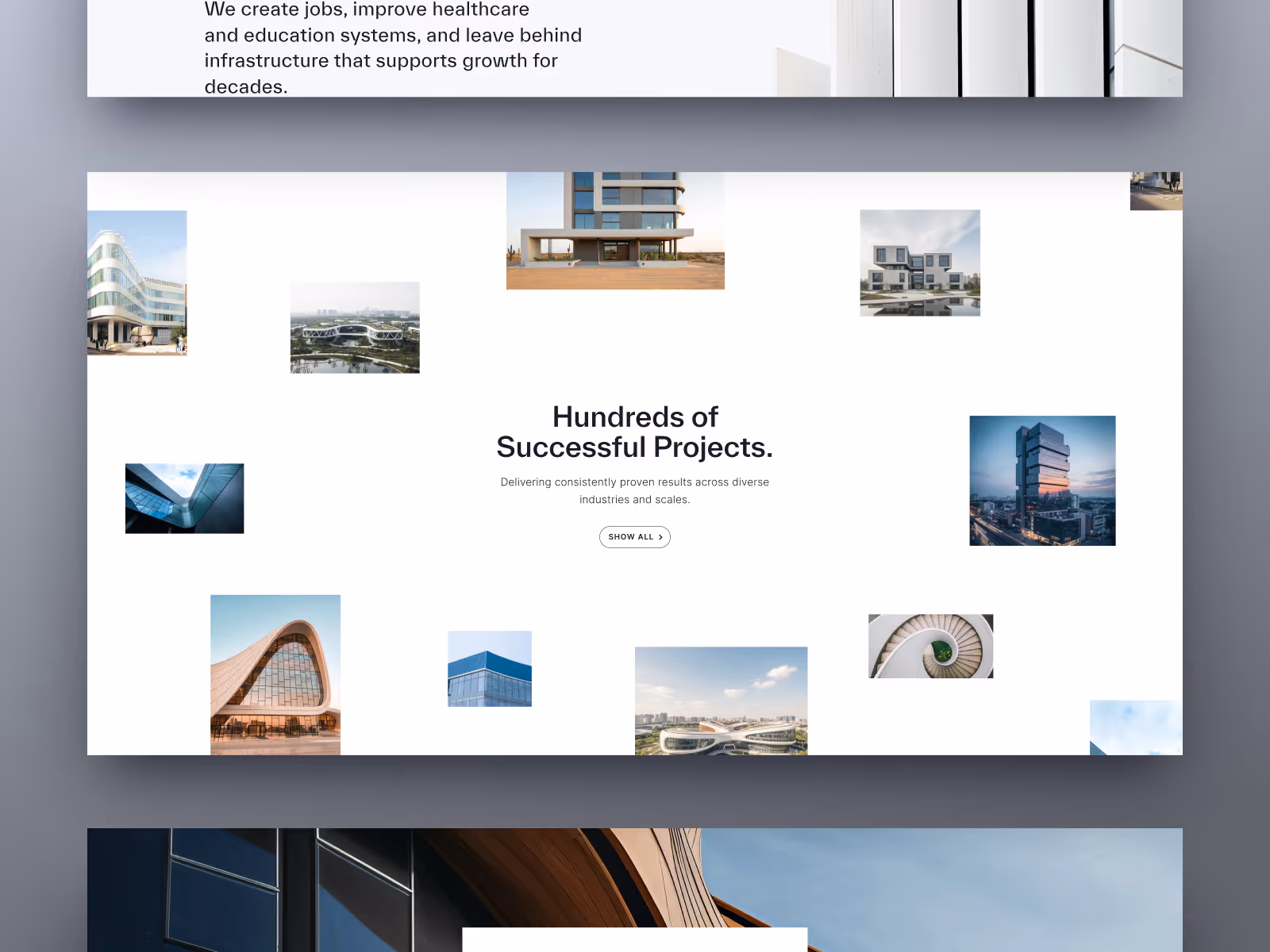
- Services stay connected to proof. The site does not treat services as isolated labels. The structure keeps company expertise close to project context, so visitors can understand what the team does and why that work feels credible.
- The visual language supports scale. Large imagery, confident typography, and clean spacing help the company feel established. The page avoids decorative noise because construction and architecture audiences need clarity more than visual excess.
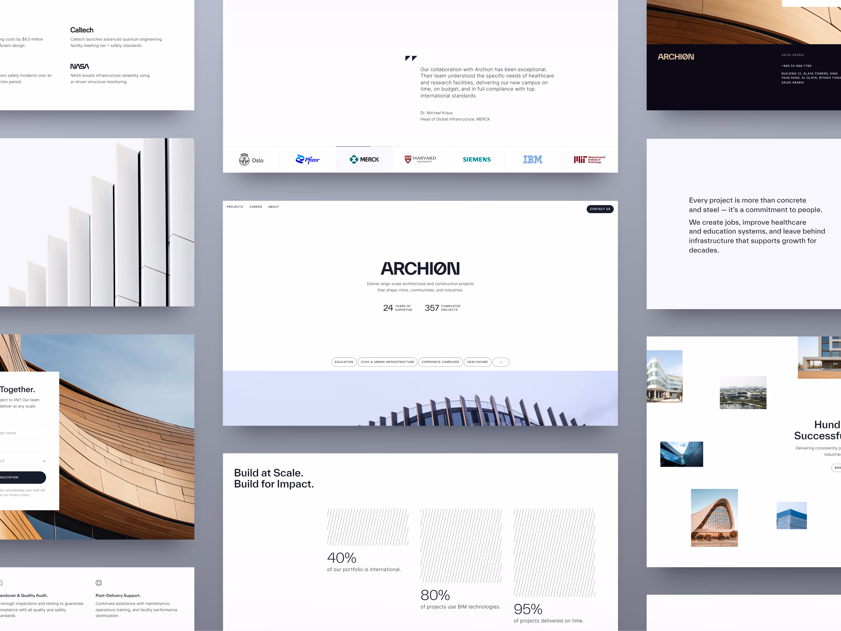
- The page guides inquiry without rushing it. The concept gives visitors enough context before asking them to act. Services, project signals, and contact cues are arranged to support a more informed first conversation.
- The structure can grow with the company. The modular page system can support more project examples, service details, or sector-specific content later. That makes the concept useful beyond the first presentation layer.
Concept outcome
The concept gives the architecture and construction company a clearer digital foundation for trust. Visitors can understand the firm’s expertise, read the structure of its services, and see enough project context to feel that the company is worth contacting.
For the business, that clarity helps the website support better-fit inquiries instead of acting only as a visual portfolio. It gives the team a stronger starting point for future service pages, case examples, and conversion paths.
Need a clearer website direction?
If your company needs to present complex work with more clarity, trust, and structure, we can help shape the first website concept.