Property booking mobile app design concept
Booking app concept for browsing stays, comparing options, and managing trip details.


The challenge
Booking a stay can become messy fast. Users need to compare places, understand trip details, and move toward a reservation without losing confidence in what they are choosing.
For this concept, the interface had to make discovery feel calm and practical. The experience needed enough visual context to support decision-making, but not so much that the booking path became heavy.
Concept direction
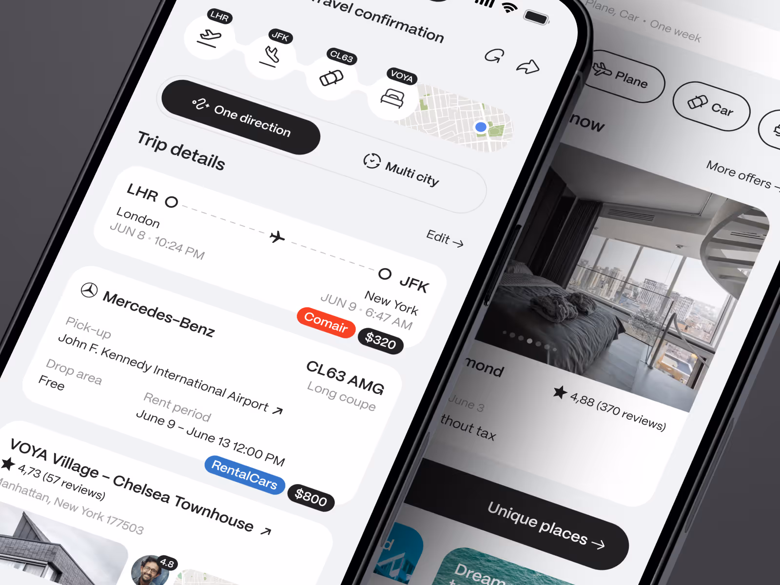
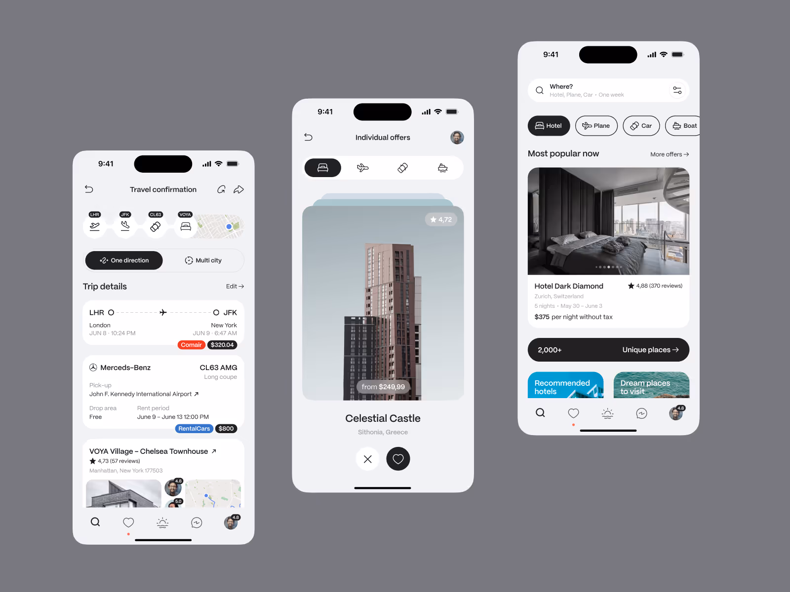
The mobile app direction is built around a clear trip-planning flow. Users can browse properties, compare options, review key details, and keep travel information close as they move through the app.
We kept the structure focused on the moments that matter most: finding a relevant place, understanding what makes it suitable, and knowing what to do next. That gives the product a cleaner path from interest to booking.
Scope of work
- Property browsing UX direction
- Stay comparison and detail screens
- Booking flow structure
- Travel management interface
- Mobile UI system for a booking product
- Development-ready mobile app assets
Key decisions behind the concept
- Property context comes before commitment. The design gives users enough information to understand a stay before asking them to move forward. Location, imagery, details, and trip context all work together instead of living as separate steps.
- The booking path stays light. The concept avoids making every screen feel like a checkout. It keeps exploration and action close, so users can compare options without feeling pushed too early.
- Travel details stay easy to return to. A booking product does not end at the reservation moment. The interface keeps trip information visible and manageable, so the app can support both planning and post-booking use.
Concept outcome
The concept gives the product a clearer mobile booking direction: browsing, comparison, booking, and trip management can live in one simple flow. It helps the team evaluate how much information users need before they feel ready to reserve.
For a founder or product team, that clarity matters before investing in full product development. It creates a shared reference for the core screens, booking logic, and the first version of the mobile experience.
Need a clearer booking experience?
If your product needs to turn browsing, comparison, and booking into one focused flow, Conceptzilla can help shape the first version before the full build.