Coffee machine e-commerce website design concept
Buying a premium coffee machine needs clear product value, not just a polished storefront.


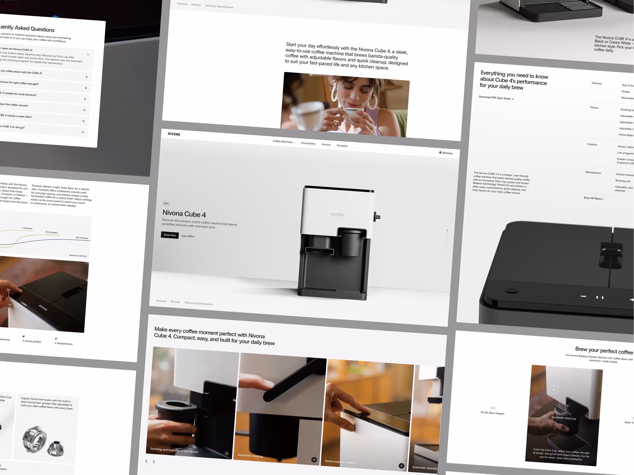
The project direction turns a product-led storefront into a clearer shopping experience. Product benefits, feature details, and purchase cues stay close enough for visitors to compare, understand, and move toward a decision without feeling pushed.
The challenge
A premium coffee machine is not a simple impulse purchase. The site has to make the product feel desirable, but it also has to answer practical questions about quality, use, features, and value.
The project needed to balance product storytelling with e-commerce clarity. Too much lifestyle language would weaken purchase confidence. Too much technical detail would make the experience feel flat and difficult to scan.
Concept direction
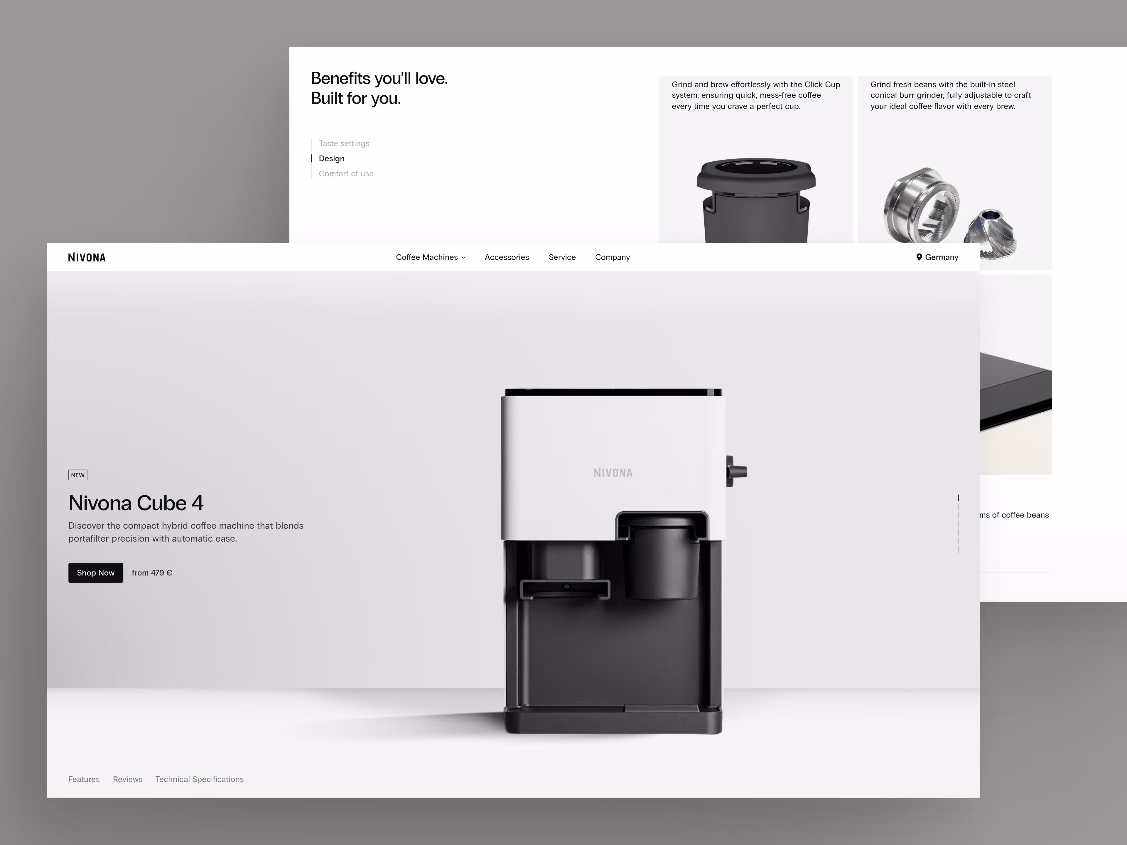
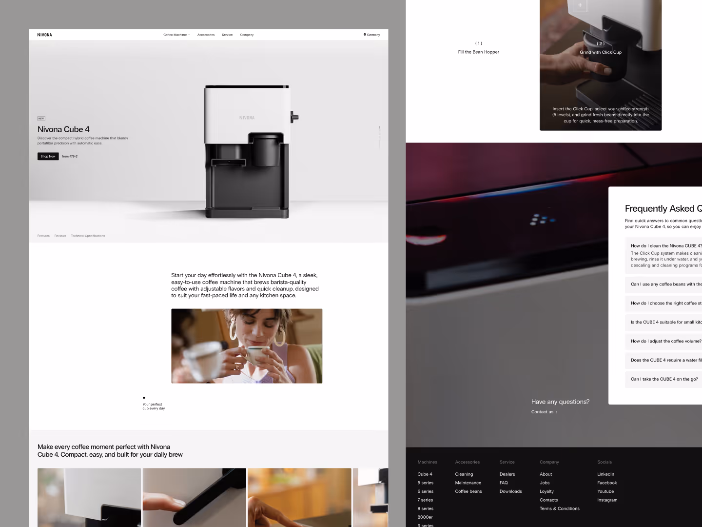
We shaped the website around product clarity first. The layout gives the coffee machine enough visual presence to feel premium, while keeping the core product information close to the buying path.
The concept uses clean spacing, focused product imagery, and a restrained interface rhythm. The goal was to make the page feel calm and confident, not overloaded with sales pressure.
Scope of work
- E-commerce website design direction
- Product page structure for a premium coffee machine
- Feature and benefit presentation
- Purchase flow and conversion cues
- Content hierarchy for product comparison
- Development-ready e-commerce concept assets
Key decisions behind the concept
The main design decisions focused on making the product easier to understand while keeping the website visually premium.
- Product value comes before interface decoration. The design gives the coffee machine a strong visual presence, but the page does not rely on imagery alone. The structure keeps benefits, product details, and purchase context visible enough to support a decision.
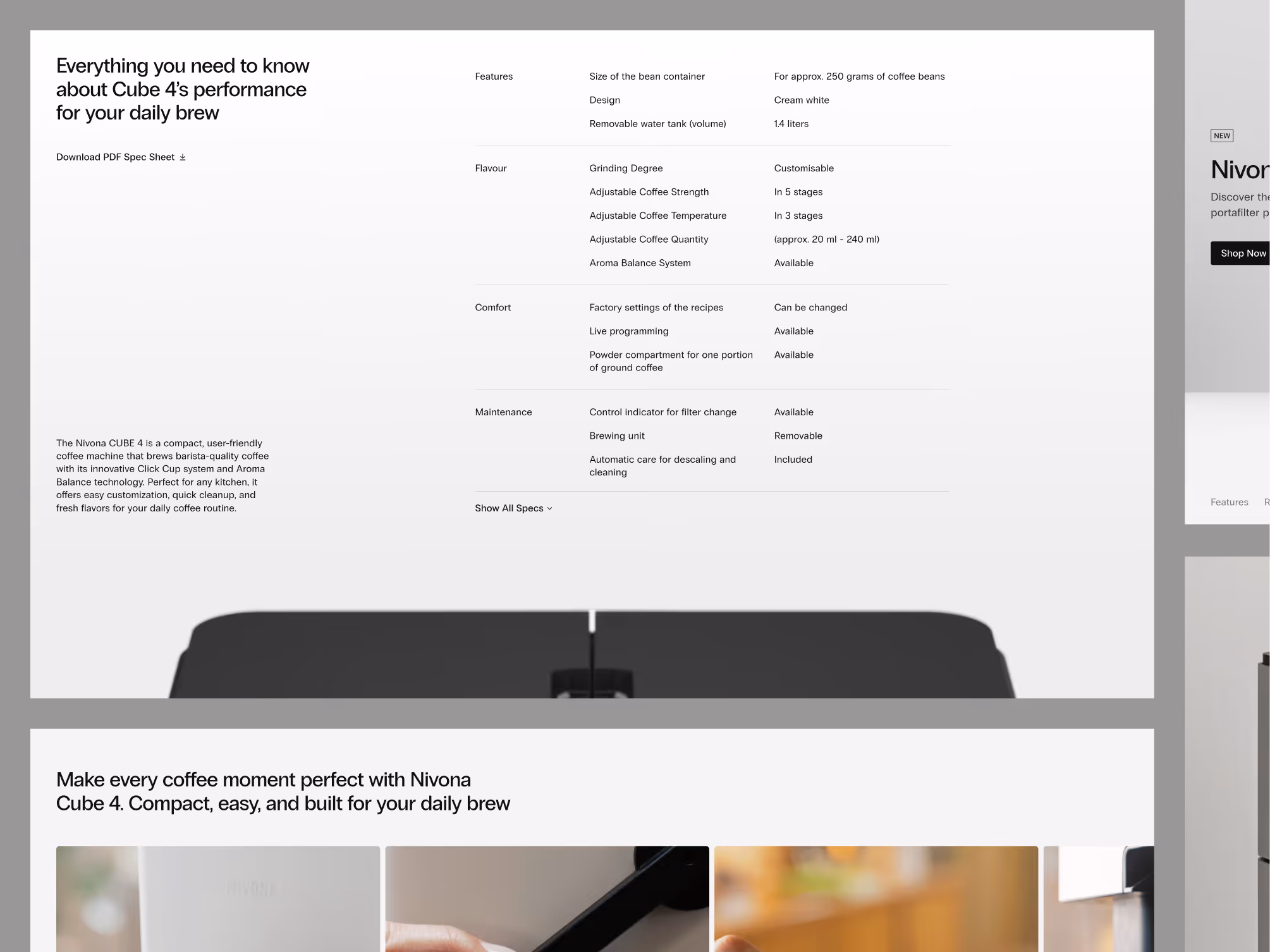
- Specifications stay connected to benefits. Technical details are most useful when they explain why the product matters. The concept keeps product information close to the story, so visitors can understand both what the machine does and why it is worth considering.
- Commerce flow stays calm. The page avoids aggressive purchase pressure. Calls to action, product blocks, and supporting sections are arranged to guide the visitor forward without making the experience feel crowded.
- The product feels premium without becoming vague. A clean visual system helps the shop feel higher-end, but the page still behaves like a working e-commerce experience. It gives the product room to breathe while keeping the buying path clear.
Concept outcome
The concept gives the coffee machine shop a stronger product and conversion foundation. Visitors can see the product, understand its value, compare the important details, and move toward purchase with less friction.
For a product team, that direction helps define what the website should explain first, how much detail the page needs, and where the interface should support confidence instead of just showing the product.
Need a sharper e-commerce concept?
If your product needs clearer positioning, stronger presentation, and a more confident purchase path, we can help shape the first website direction.