VPN mobile app design concept
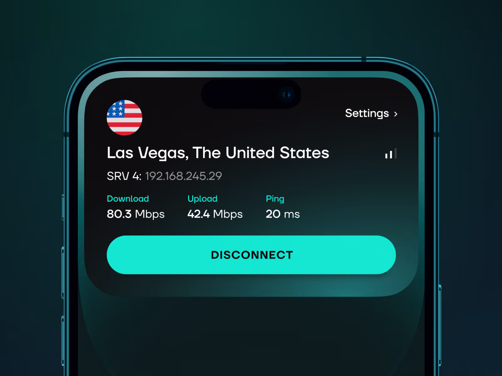
A VPN mobile app concept for secure connection, server choice, privacy status, and simple onboarding.


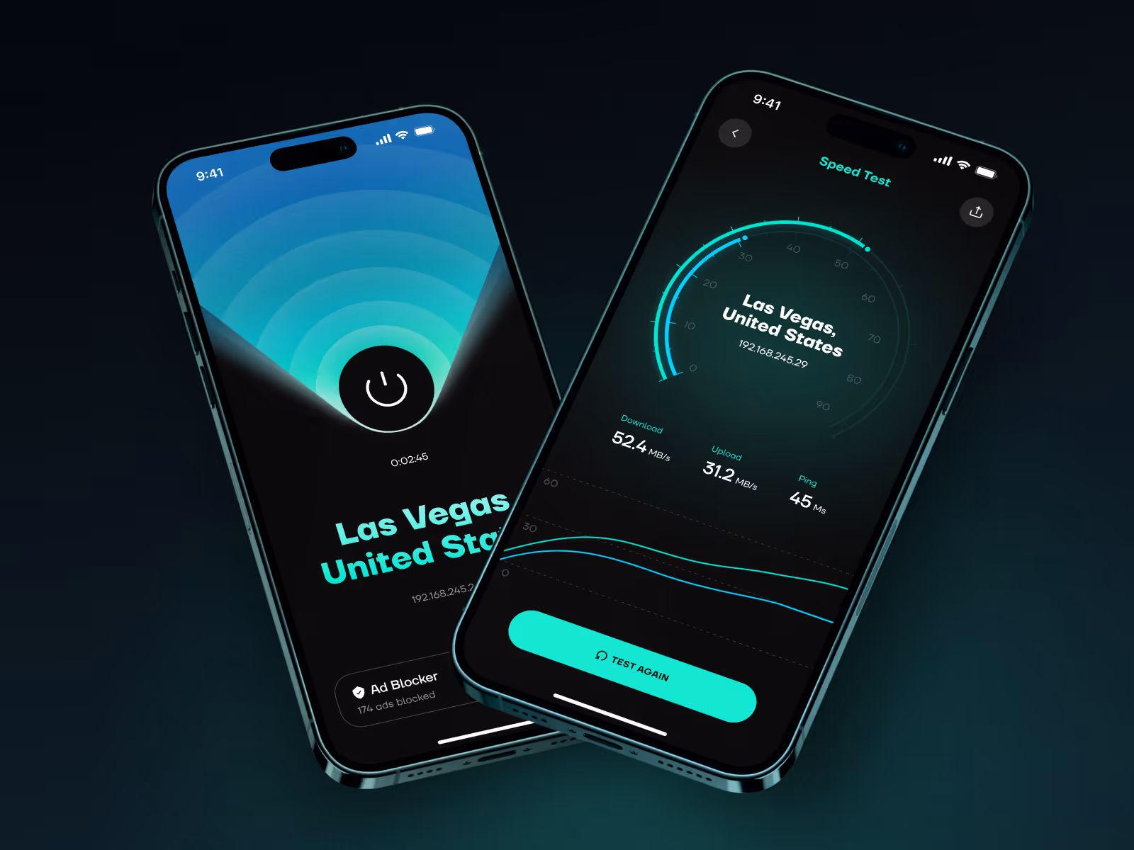

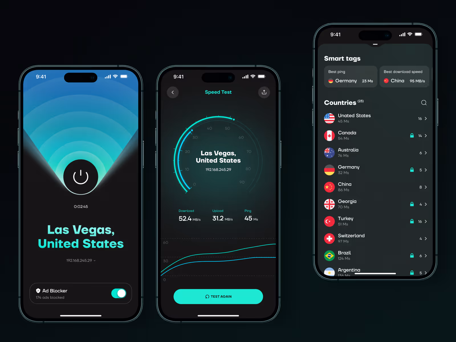
Privacy tools only work when the interface feels trustworthy and easy to act on. This direction turns connection status, server choice, and account context into a mobile flow users can understand quickly.
The challenge
A VPN app has to explain protection without making the experience feel technical or alarmist. Users need to know whether they are connected, which server they are using, and what level of privacy they have, but the interface still has to feel simple enough for everyday use.
The main challenge was to keep the core action visible while making secondary choices, such as location, account details, and connection settings, easy to reach without crowding the screen.
Concept direction
We shaped the app around one clear state: the user either has protection on, needs to connect, or needs to adjust the server. The main screen keeps connection status, location, and primary action close together, so the product can be understood at a glance.
Supporting screens give the user a cleaner way to compare locations, manage account context, and understand service status. The visual system stays calm and direct because trust matters more than heavy security language.
Scope of work
- Mobile app UX direction for a privacy product
- Connection status and server selection flow
- VPN onboarding and account screens
- Trust-focused visual system
- Microinteractions for connection feedback
- Development-ready mobile UI assets
Key decisions behind the concept
- Connection status stays obvious. The core screen makes the protection state easy to read before anything else. Users should not have to guess whether the VPN is active.
- Server choice feels fast, not technical. Locations and server options are structured as a practical choice, not a dense technical list.
- Privacy signals are visible without fear-based copy. The interface communicates safety and control through hierarchy, state, and tone instead of dramatic warnings.
- Settings stay secondary. Account and configuration screens remain accessible, but they do not compete with the main connection flow.
Concept outcome
The concept gives a VPN product a clearer mobile direction before deeper implementation. It shows how the app can feel secure without becoming heavy, technical, or alarmist.
For a founder or product team, that clarity helps align onboarding, trust signals, core screens, and the first development scope around one simple experience.
Need a sharper product direction?
Start with a focused concept that turns the core experience into screens your team can evaluate, discuss, and build from.