Crypto exchange website design concept
Crypto products need a website that makes trading feel clear before users enter the app.


The website direction focuses on the first product decision layer: what the exchange offers, why it feels credible, and how quickly a visitor can understand the platform before signing up.
The challenge
Crypto exchange websites need to do two jobs at once. They have to explain the product clearly while making a complex financial environment feel usable and trustworthy.
Visitors are often deciding whether the exchange feels credible before they ever create an account. The page needed to present trading features, product logic, and market energy without turning into a dense product manual.
Concept direction
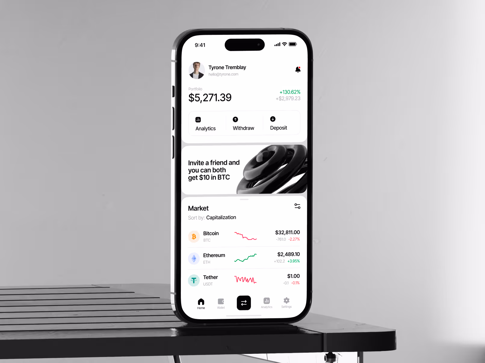
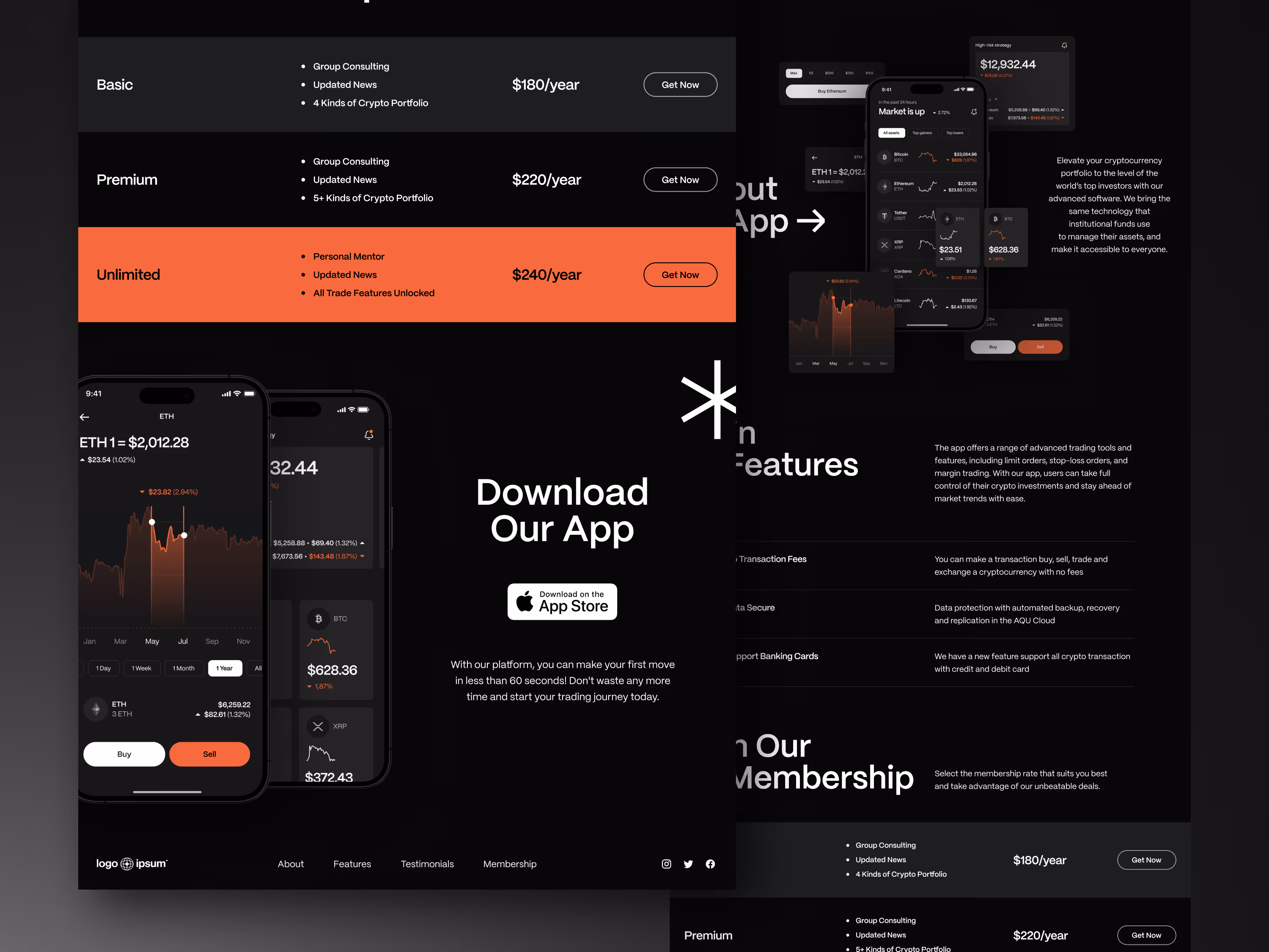
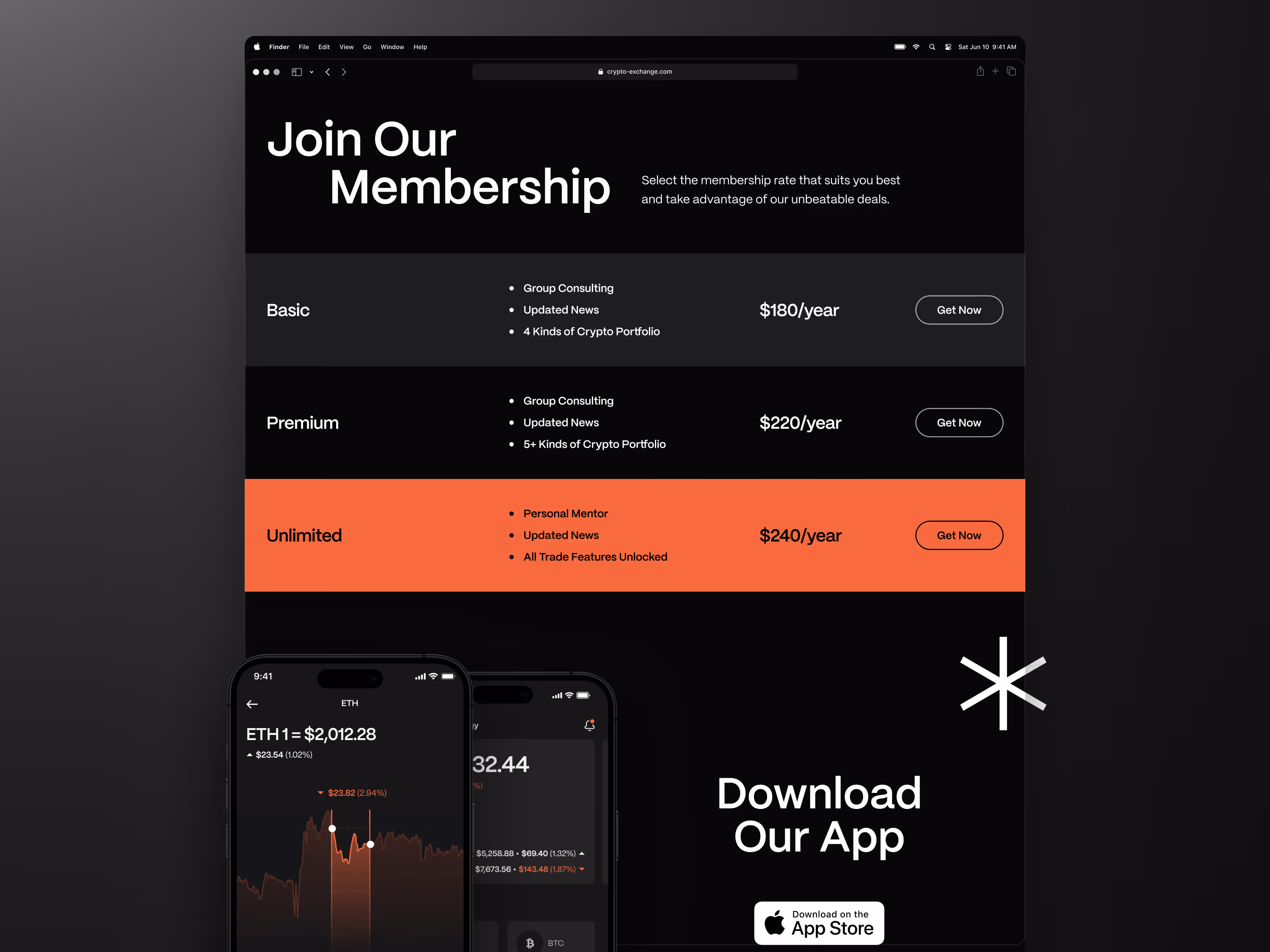
We shaped the website as a focused product landing experience for a crypto exchange. The structure combines a bold first screen, clear feature blocks, market cues, and a visual system that feels active without becoming chaotic.
The design keeps the messaging direct. It gives visitors enough context to understand the platform, while leaving the deeper trading experience for the product itself.
Scope of work
- Crypto exchange website direction
- Product landing page structure
- Trading feature presentation
- Trust and onboarding content hierarchy
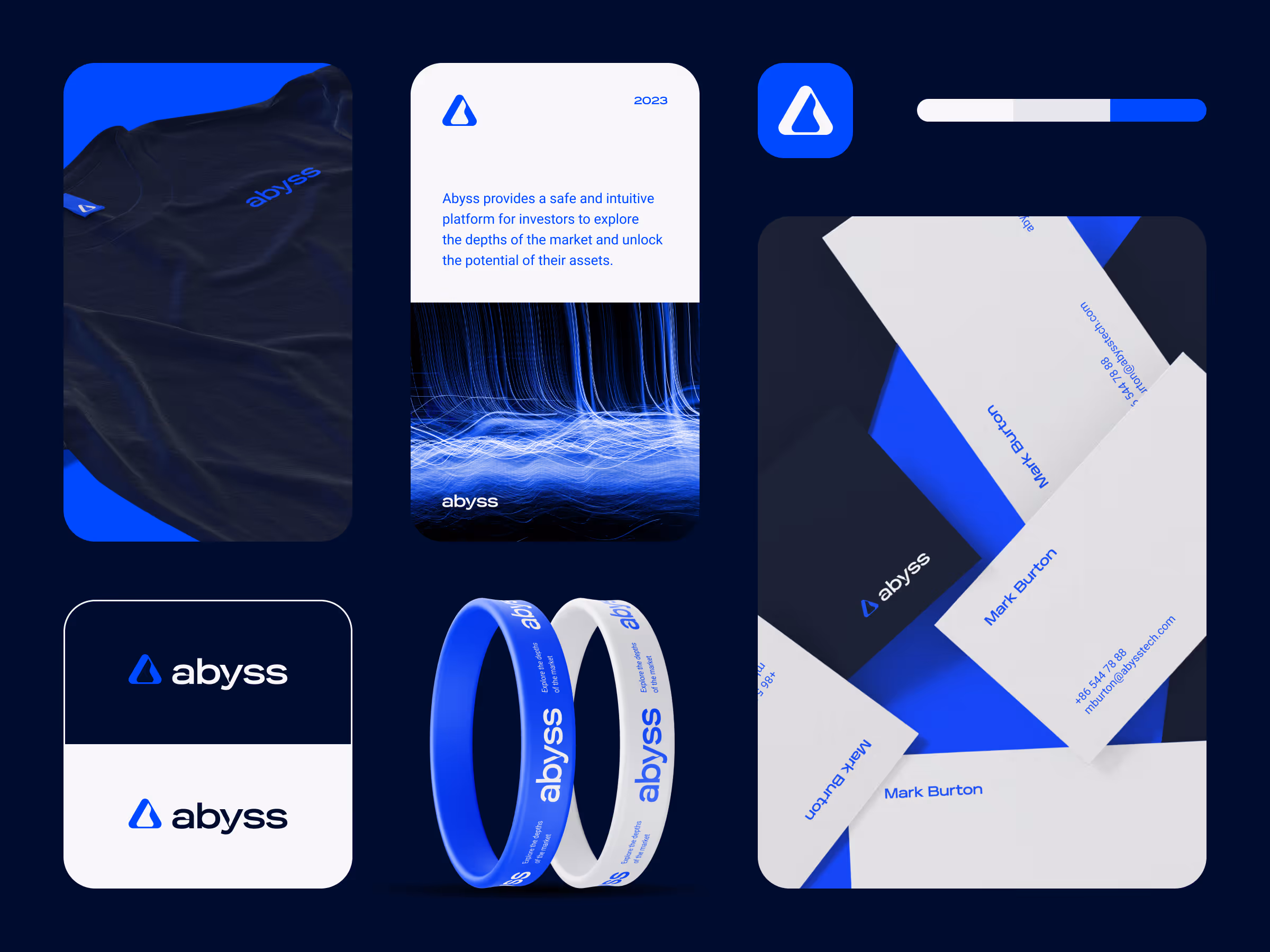
- Visual system for a crypto product
- Conversion-focused sign-up flow
- Development-ready concept assets
Key decisions behind the concept
The main decisions focused on making the exchange feel credible, understandable, and quick to evaluate from the first screen.
- Product clarity before feature density. Crypto products can overload visitors with claims, charts, and technical terms. The website gives the core product story a clear path before going deeper into features.
- Trust cues stay close to conversion moments. The concept treats credibility as part of the page structure, not as a separate badge area. Security, product logic, and sign-up context stay close to the moments where users decide whether to continue.
- Market energy without visual noise. The interface uses motion-like rhythm, dark contrast, and product visuals to feel active. The goal is to suggest a live trading environment without making the page harder to read.
- The website supports the product, not just promotion. The page is not only a marketing wrapper. It gives the exchange a public-facing product layer that can support acquisition, onboarding, and future product storytelling.
Concept outcome
The concept gives the exchange a clearer front door: a website that can explain the product, support sign-up intent, and create a stronger first impression before users enter the trading interface.
For a product team, that direction becomes a practical reference for messaging, visual language, onboarding logic, and the first conversion flow.
Need a sharper product website?
If your product needs to explain a complex offer with more clarity, we can help turn the first direction into a focused concept.