Apter pharmaceutical medical company brand identity
Identity direction for a medical brand that needed to feel credible, calm, and easy to trust.


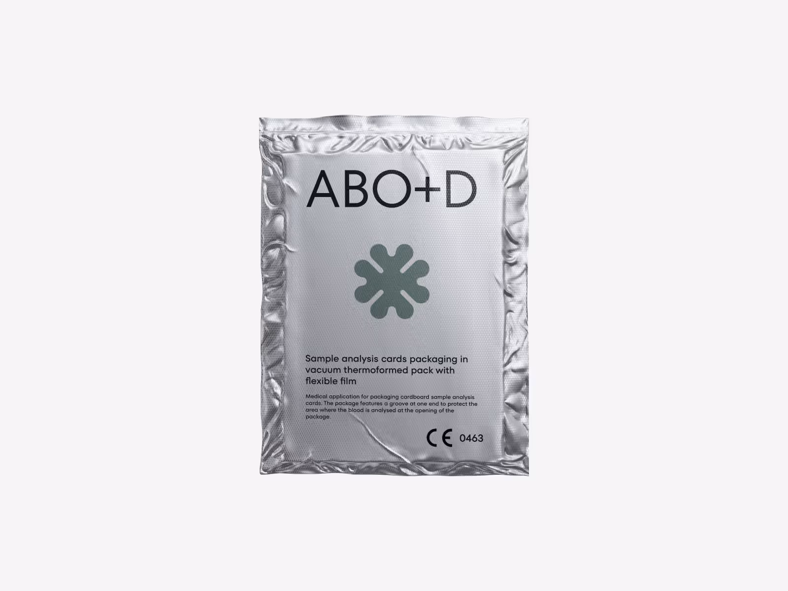
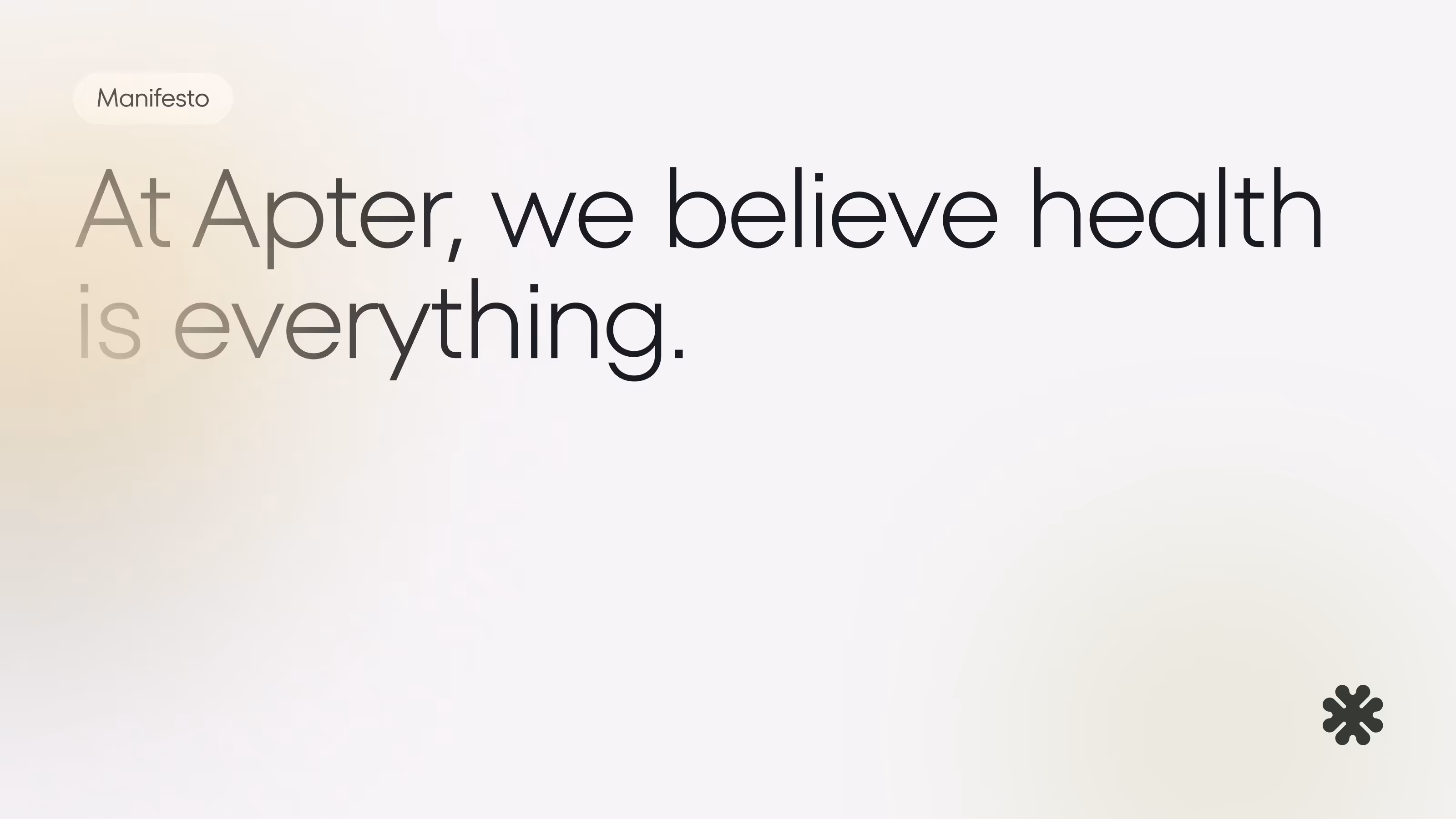


A medical brand has to build confidence before a product, service, or sales conversation begins. The identity needed to feel clinical enough to be trusted, but not so cold that it lost clarity or approachability.
We shaped the brand direction around a restrained visual system, clear naming presence, and a tone that could support healthcare, pharmaceutical, and product-facing communication.
The challenge
Medical and pharmaceutical brands often need to communicate trust quickly. The audience may include patients, partners, investors, clinicians, or internal stakeholders, so the identity cannot rely on decoration alone.
The challenge was to create a brand direction that felt precise, credible, and calm while still being flexible enough for website, presentation, and product materials.
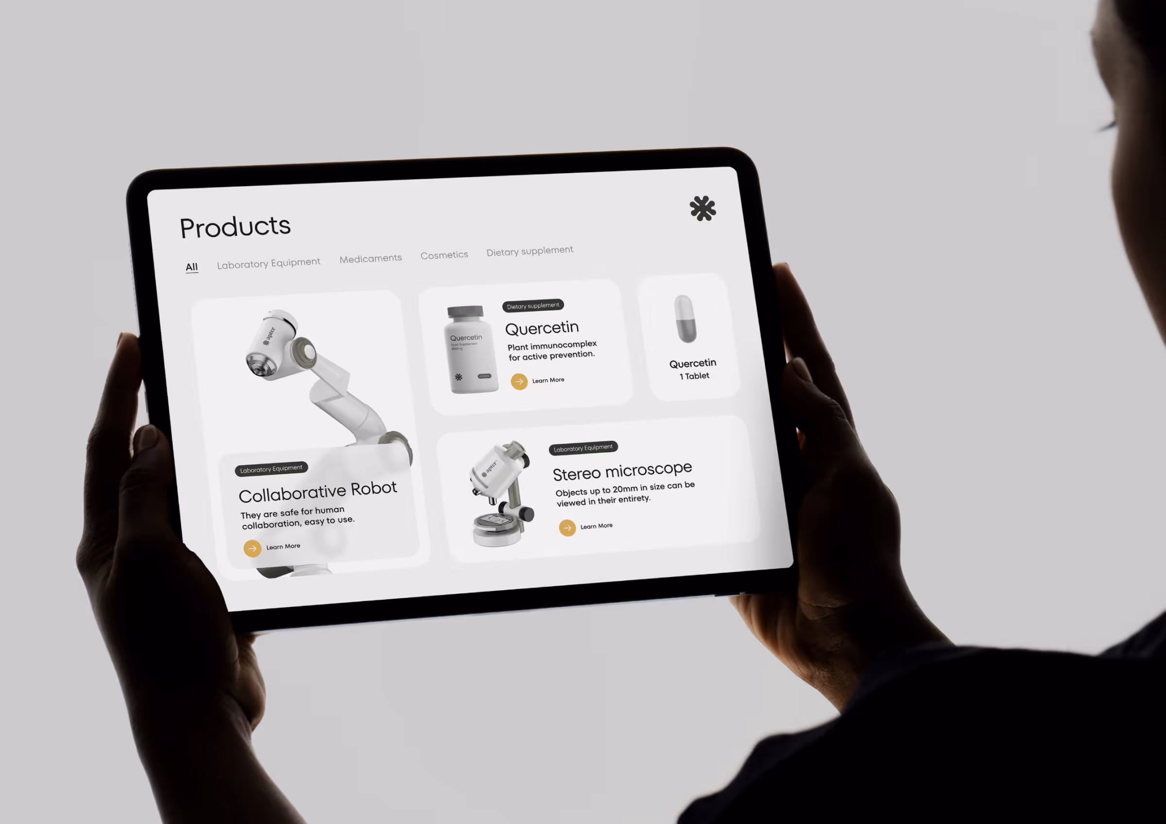
Concept direction
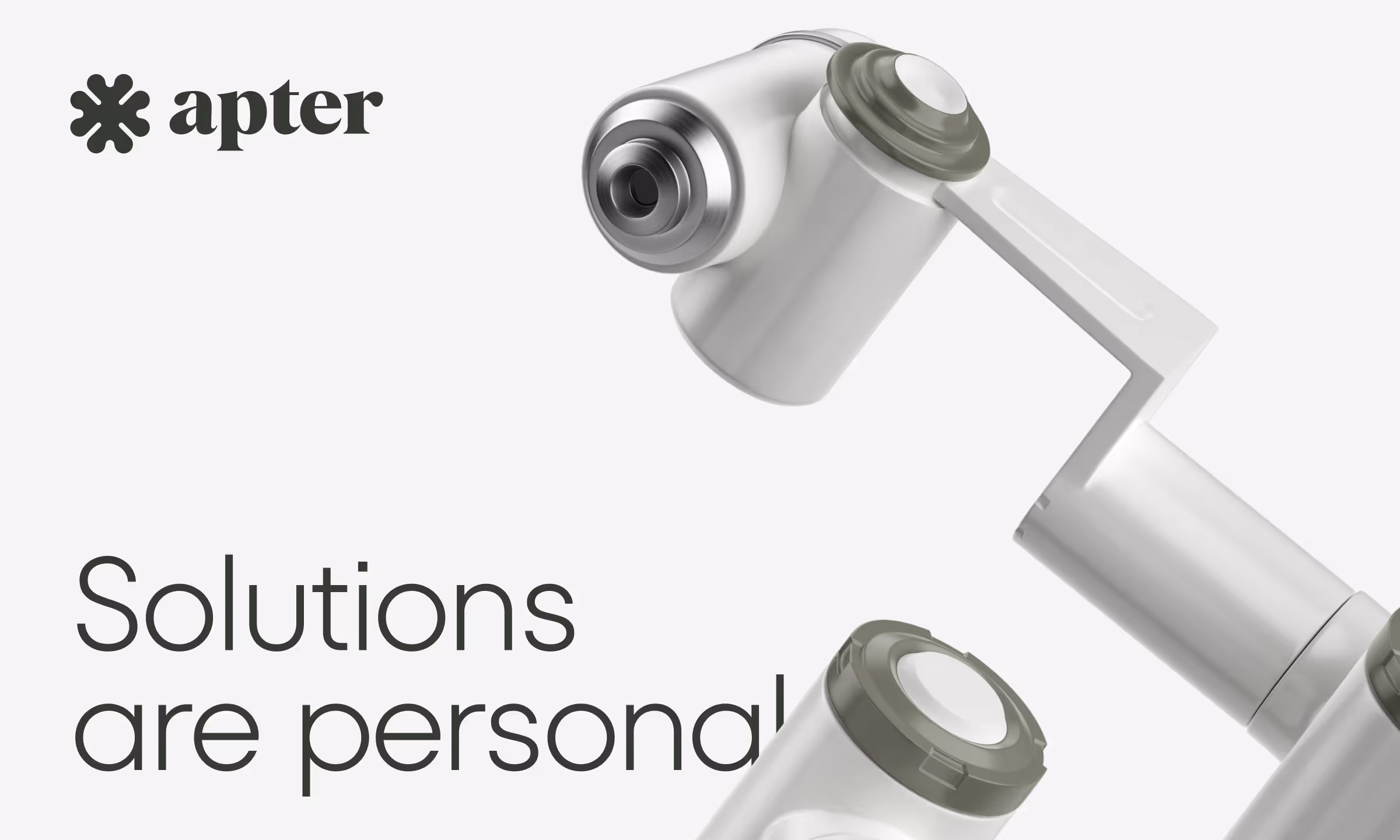
The identity direction uses a clean visual system, controlled typography, and a professional color mood to make the brand feel dependable from the first impression.
We kept the system intentionally focused. The goal was to make the brand easy to understand, easy to present, and ready to extend into digital touchpoints without creating visual noise.
Scope of work
- Brand identity direction for a medical company
- Logo and visual identity exploration
- Typography and color system
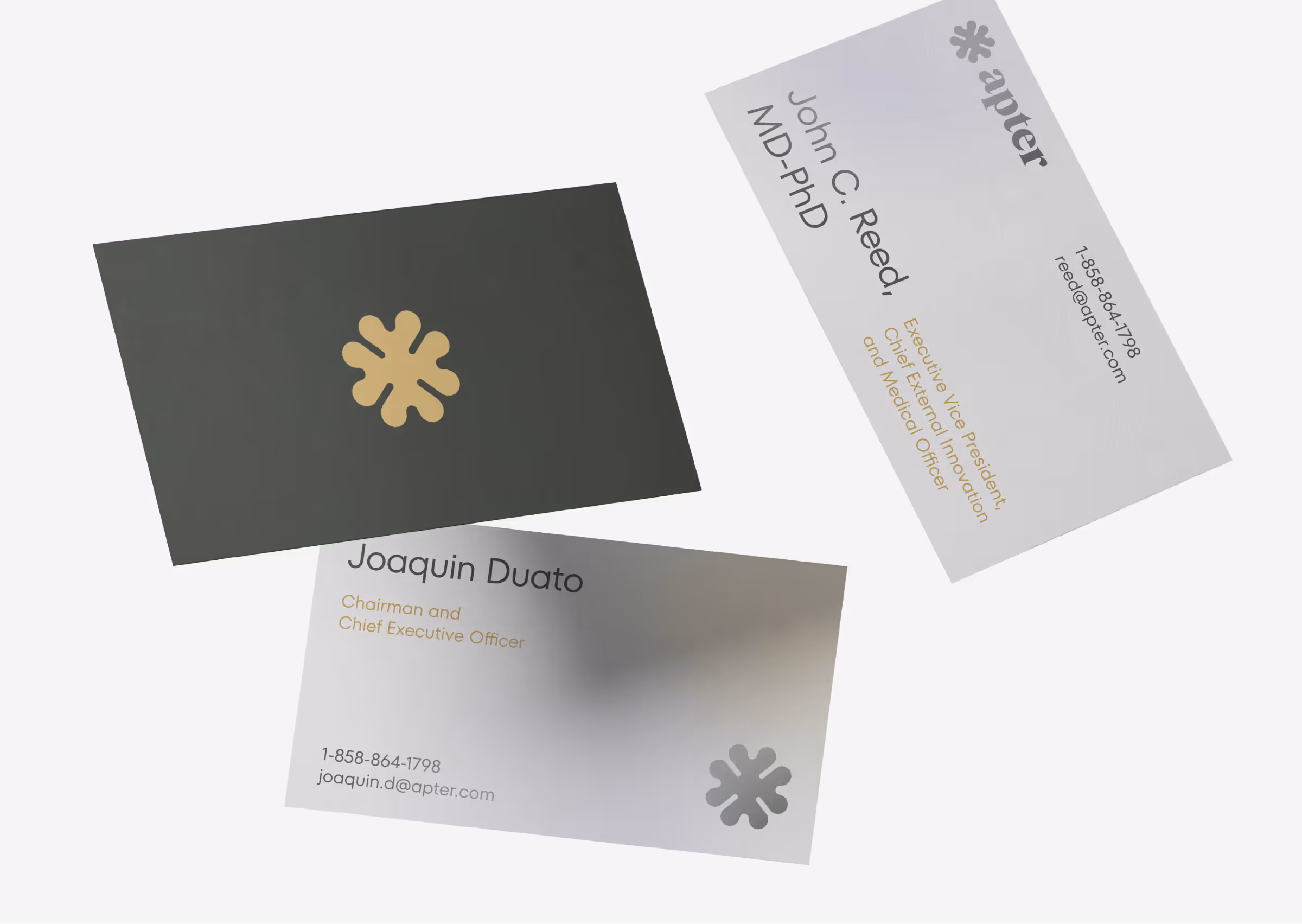
- Brand presentation materials
- Digital-ready identity assets
- Concept foundation for future website or product use
Key decisions behind the concept
- Trust before decoration. The identity avoids exaggerated healthcare visuals. It uses restraint, spacing, and clear hierarchy to create credibility without making the brand feel generic.
- A calm clinical mood. The visual system supports a medical context, but keeps enough warmth to feel human and approachable.
- Flexible identity assets. The concept was shaped so it could work across presentations, website sections, product materials, and early stakeholder conversations.
Concept outcome
The concept gives the medical brand a clearer visual foundation before deeper rollout. It helps stakeholders evaluate whether the identity feels trustworthy, understandable, and suitable for a healthcare or pharmaceutical context.
That clarity matters before investing in a full brand system, website, or product interface. It gives the team a shared direction for presentation, messaging, and future design work.
Need a clearer medical brand direction?
Share your healthcare or pharma idea and we’ll help shape a concept your team can evaluate, present, and build from.